ROKU
Augmented Reality
︎︎︎Branding
︎︎︎Experience Design
︎︎︎Print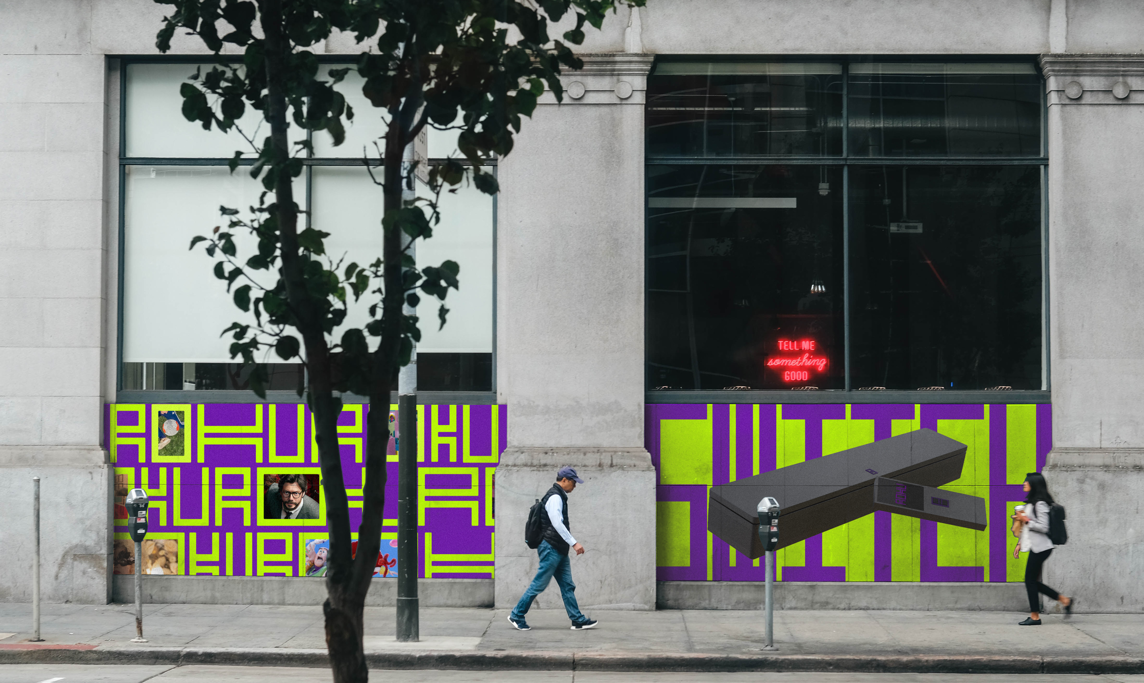
The new Roku aims to provide a straightforward and personalized experience for new cord-cutters and younger audiences. With a friendly and trustworthy voice, it aims to make users feel convenient and expand their world of joy. By doing so, it seeks to attract and engage a wider audience, encouraging more people to join Roku.
(Logo)
The new logo seamlessly transitions from a logotype to a logo mark, where the combination of the letters R, O, K, and U forms a distinct switch shape. This versatile logo design can be easily adapted and applied across various applications, allowing for stretching or squeezing to create a range of visual variations while maintaining its core identity.
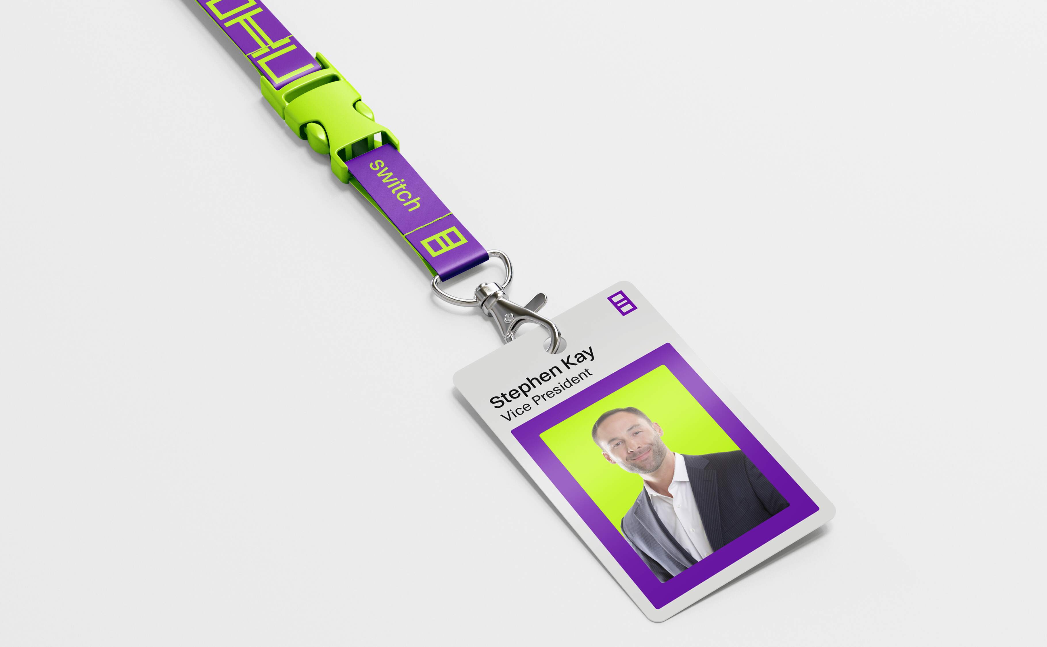
(ID System)



(Web Banner Ad)
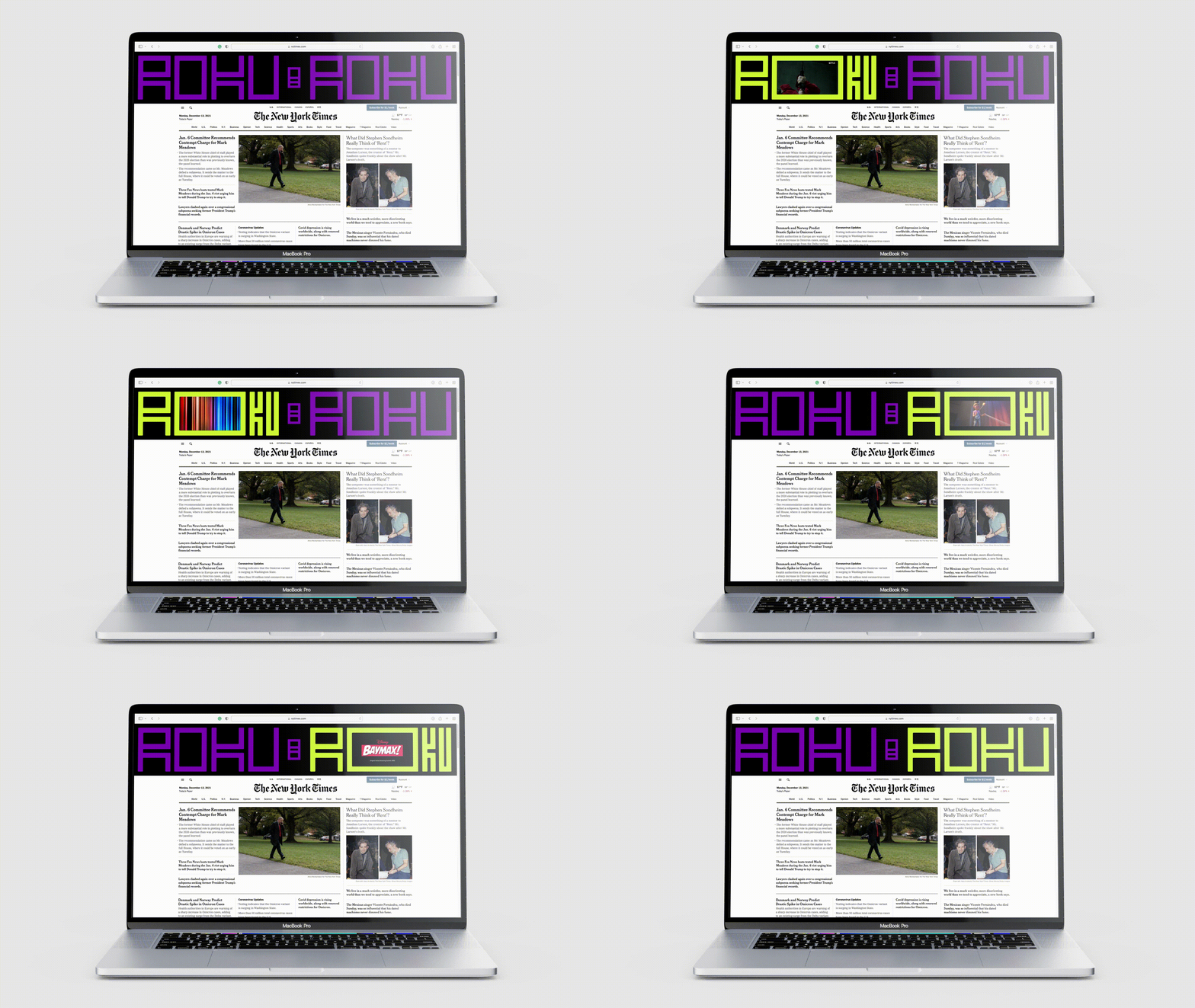
When the ROKU switch is on, the letter "O" expands and showcases trailers from various platforms. This web banner allows visitors from any website to stay informed about new release content.
(ROKU at Home)
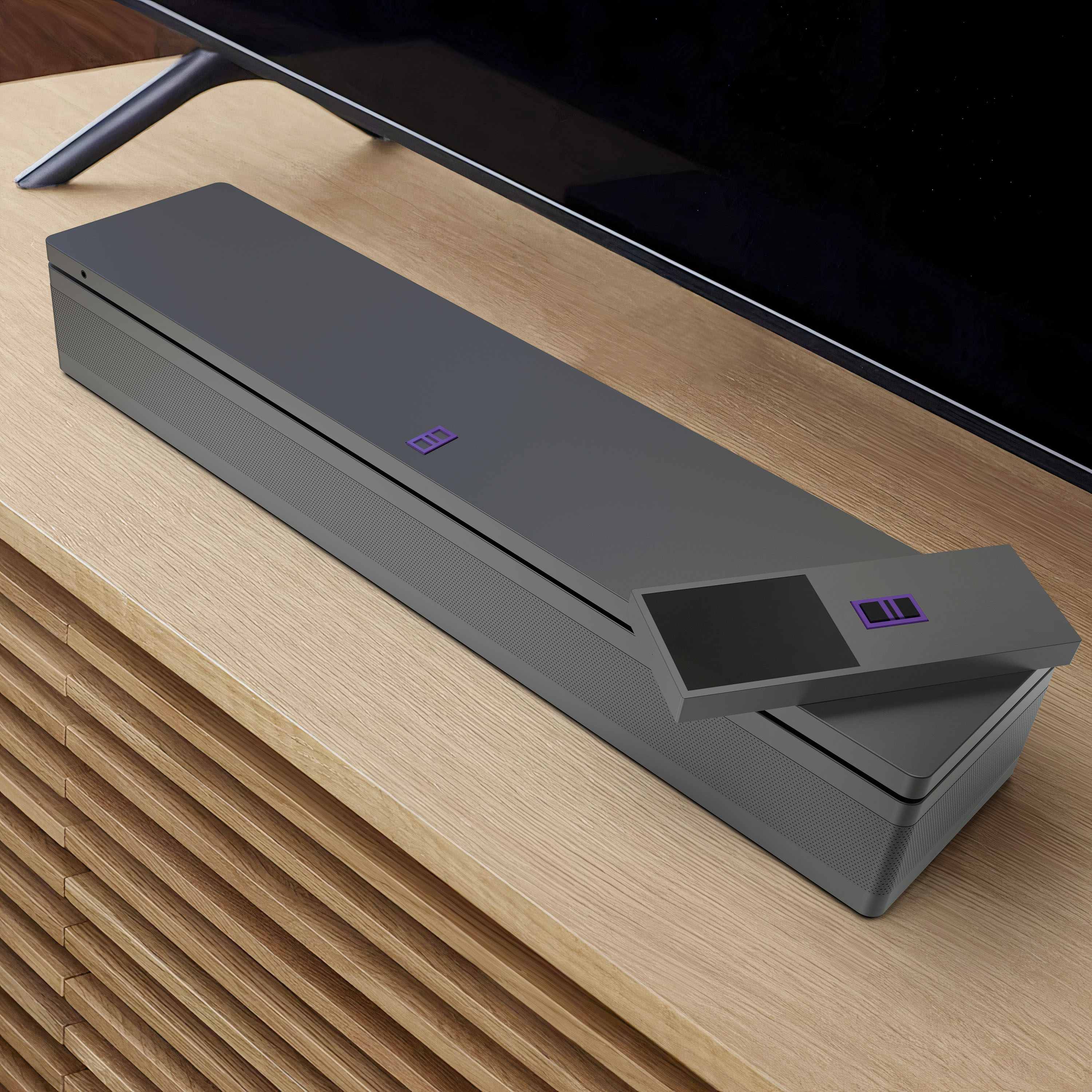
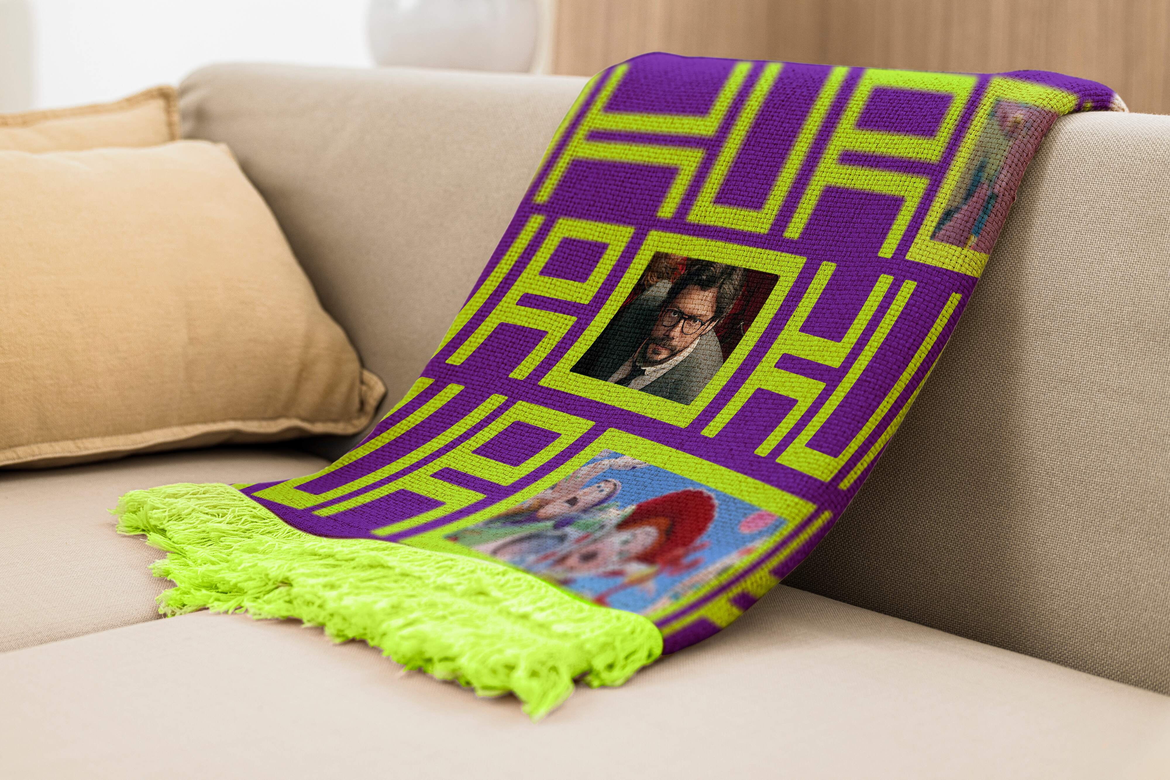
The shape of the devices is designed to embody the essence of the logo.
(Poster Series)
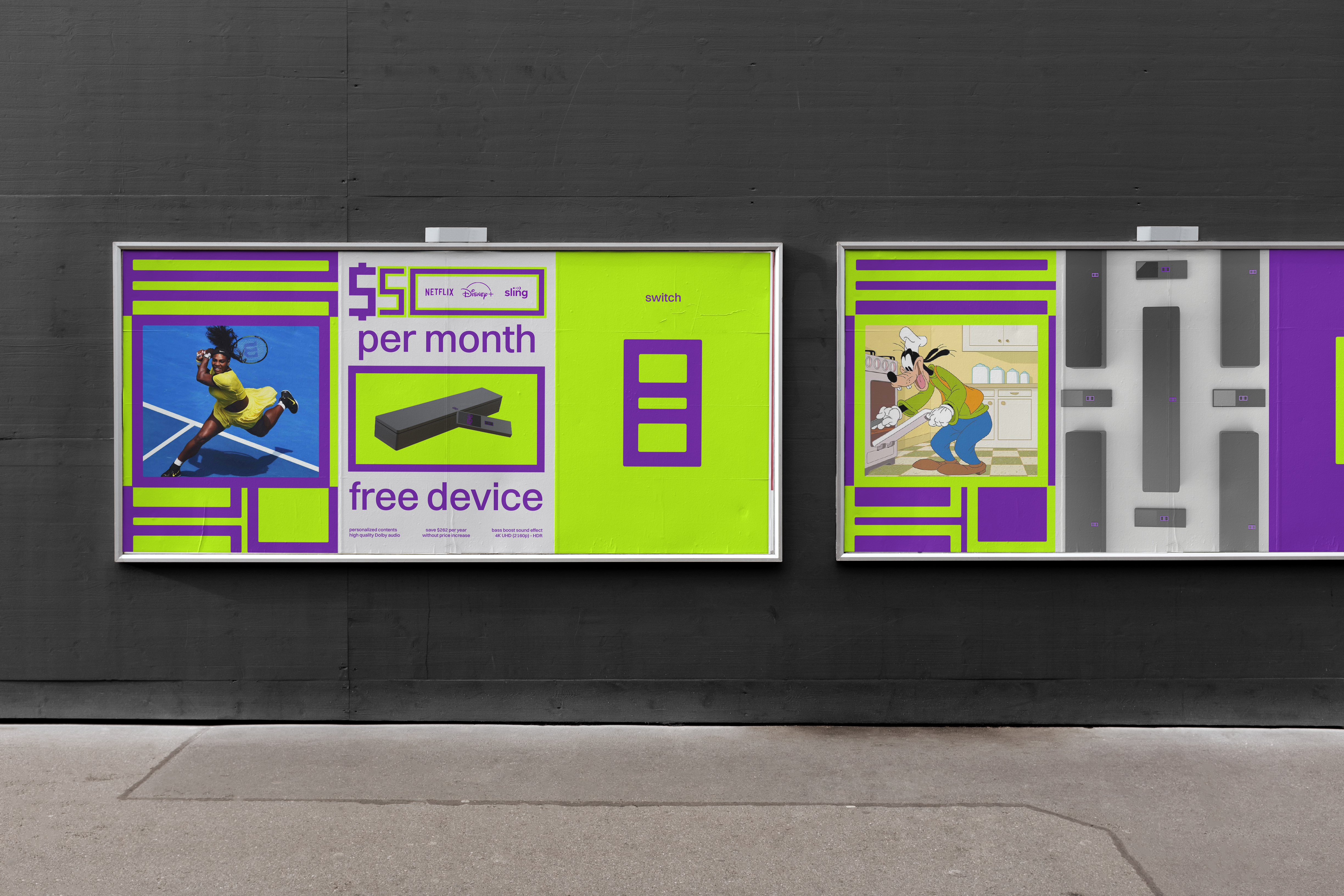
(Augmented Reality)
The ROKU AR app offers users a unique and immersive experience in unconventional locations. By scanning the ROKU logo using their mobile devices, users can witness the logo come to life in 3D, accompanied by an exclusive trailer that is accessible solely from that specific location. Done with Unity and Xcode.
(ROKU Live Sports)


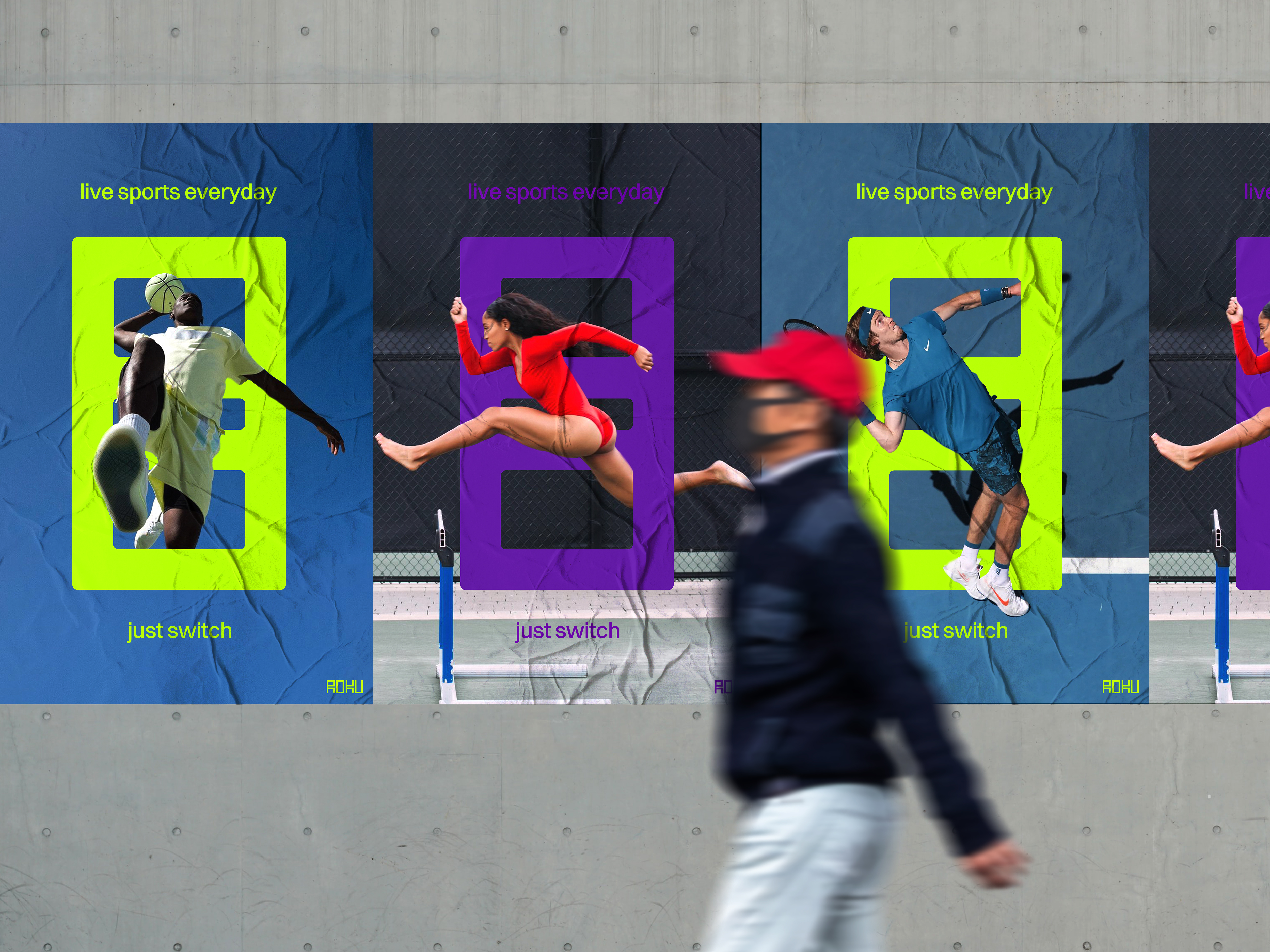
ROKU will sponsor live sports events as a strategic move to engage non-cord-cutters, recognizing that sports enthusiasts represent a vital demographic. By partnering with live sports events, ROKU seizes a remarkable opportunity to reach and captivate a large audience of passionate sports fans, who also serve as a significant pool of potential consumers.


