798 ART DISTRICT
Brand Identity
︎︎︎Font Design
︎︎︎Web
Located in Beijing, the 798 Art District is an interesting place where a former military compound has been transformed into a vibrant hub of arts, brimming with inspiration. Despite its rich offerings, the district struggles to express its unique identity. The goal of this project is to enhance the appeal and attract more visitors.
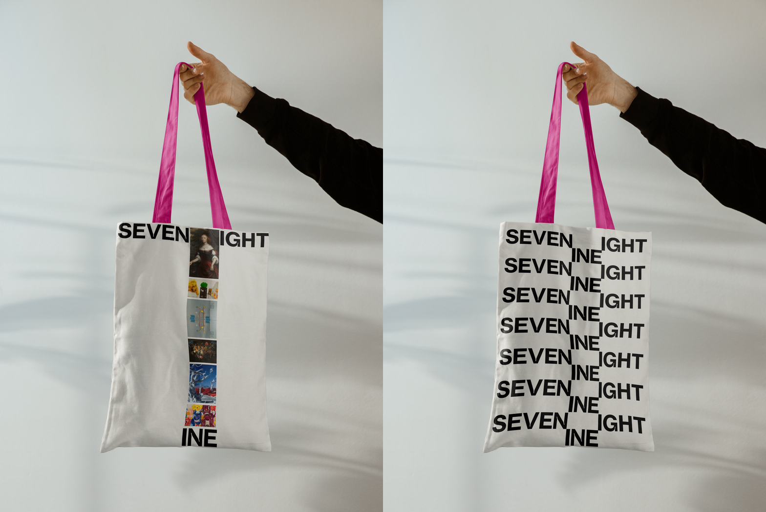
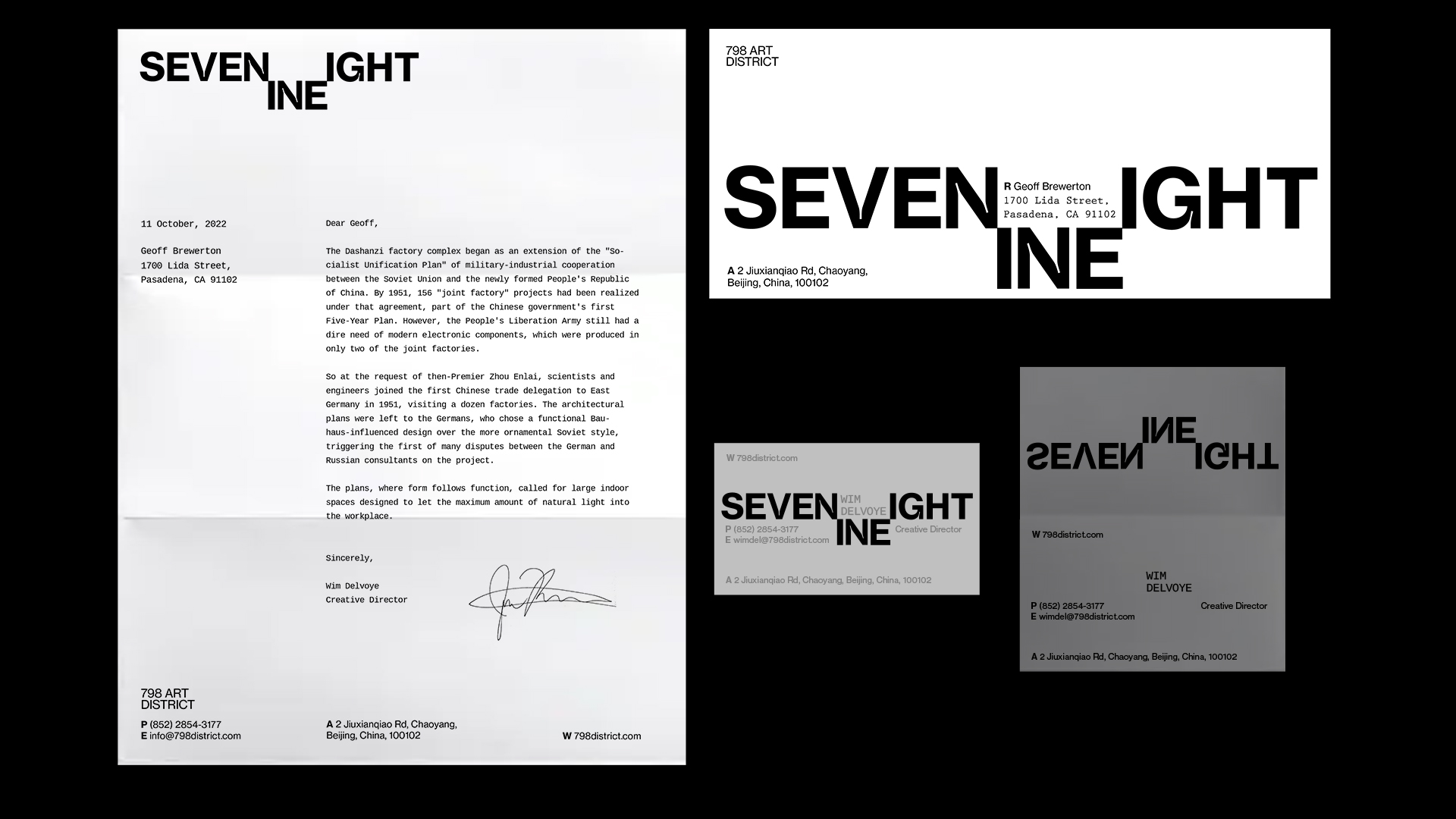
(Logo)

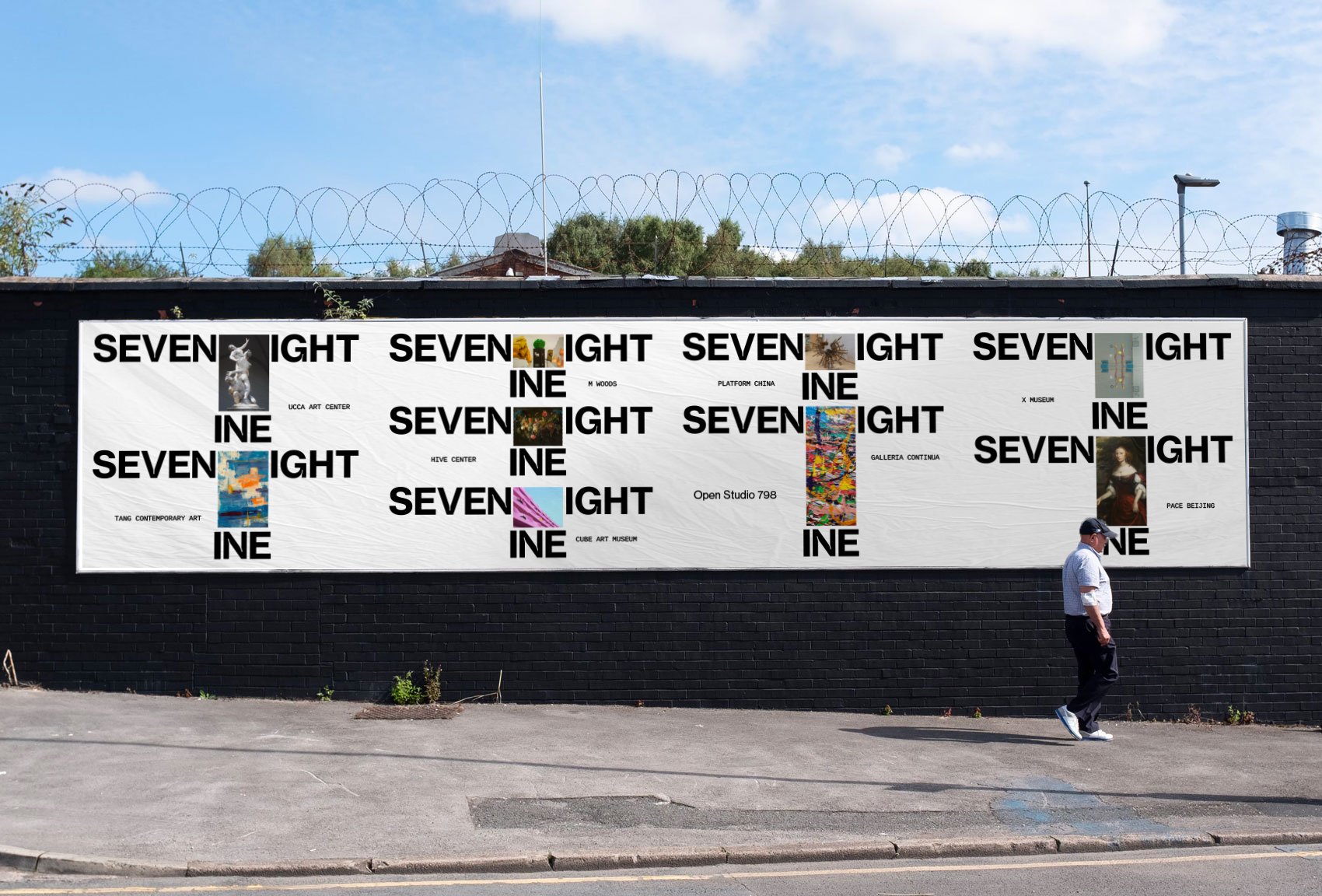
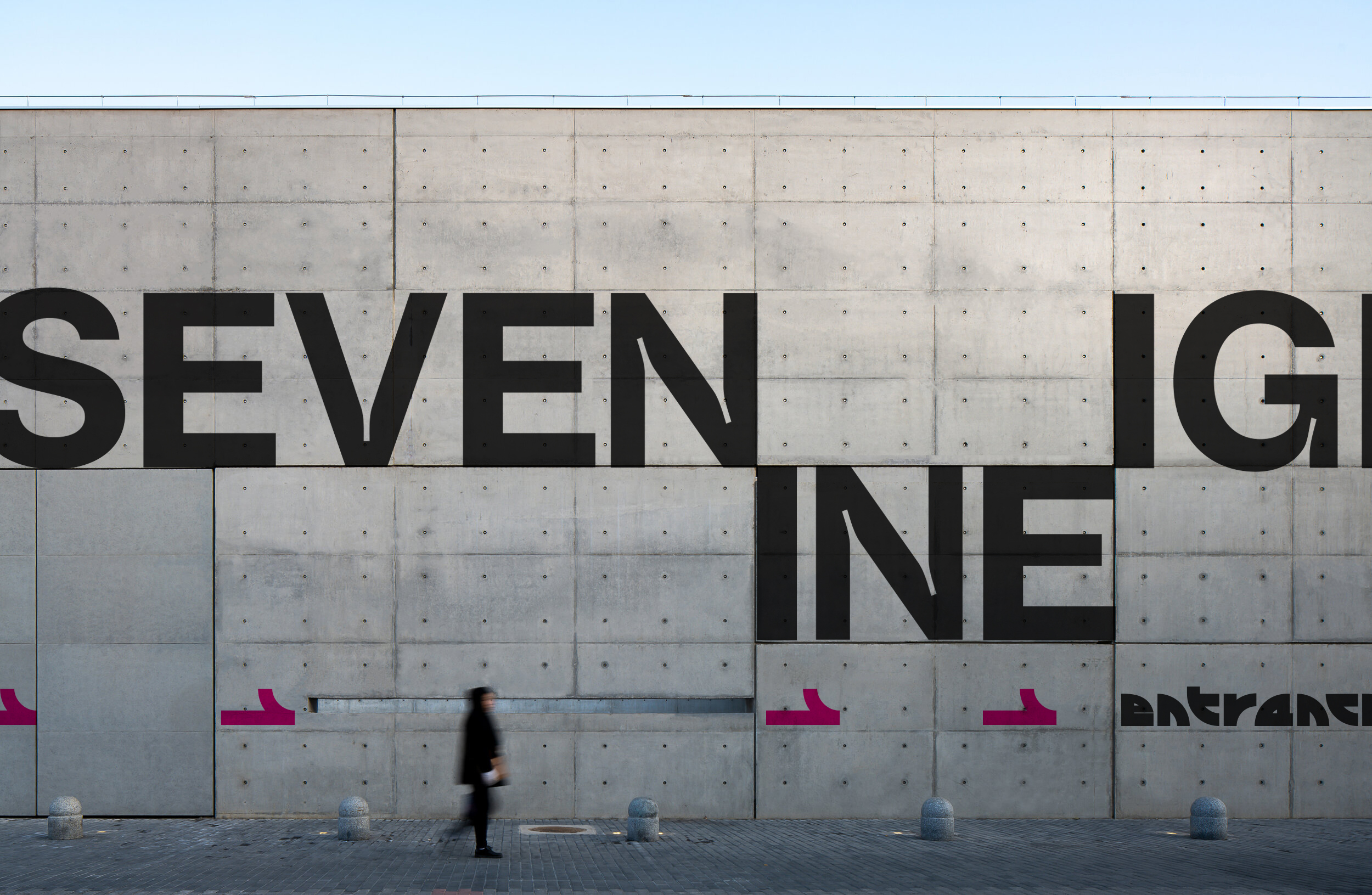
The logo's voice is intentionally neutral to harmonize with diverse and unique artworks, ensuring it does not overpower their individual styles. The clever use of the last letters in "Seven," "Nine," and "Eight" creates a visual connection, representing the organic unity and solidarity of art.
(Stationery)
(Stationery)
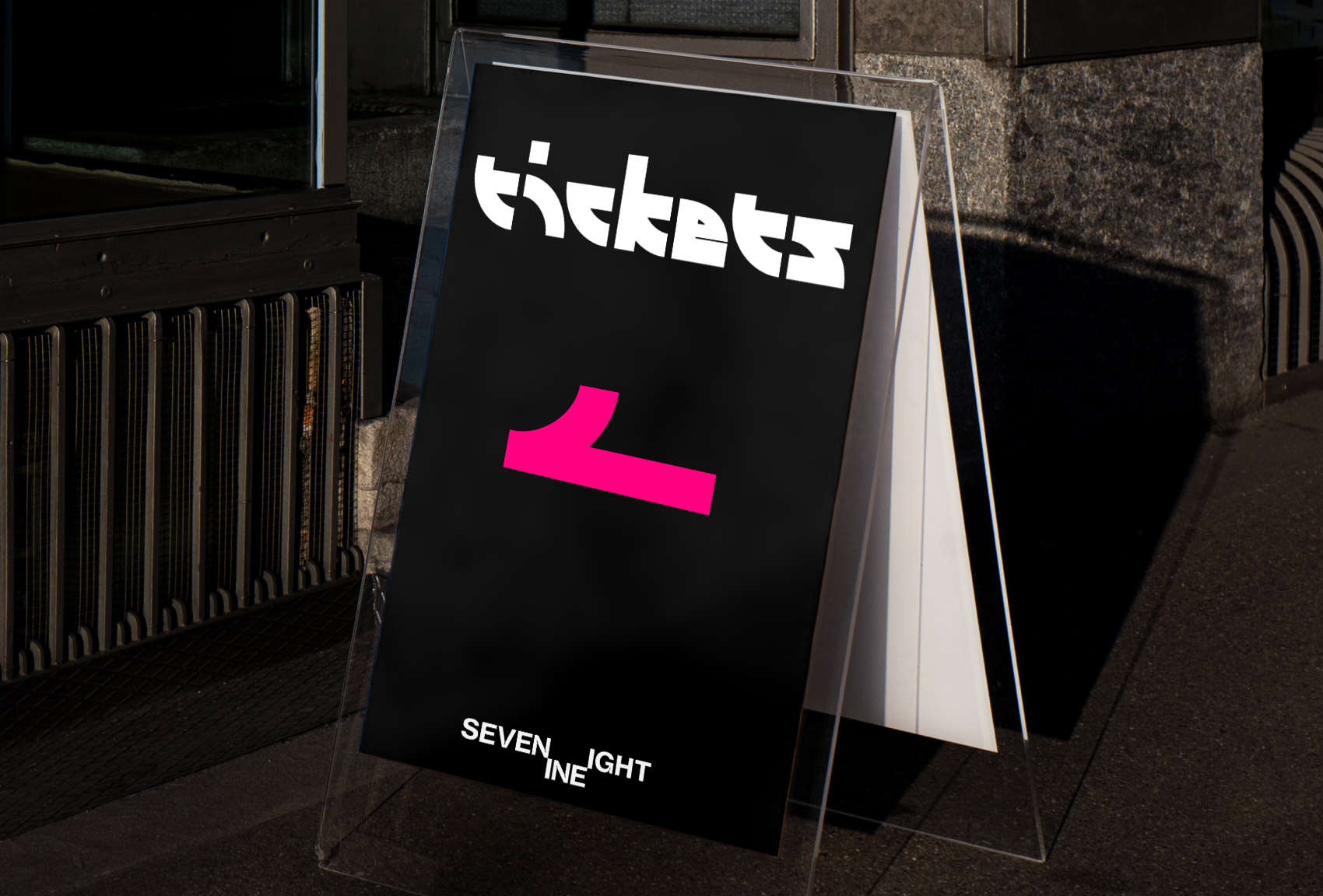
(Display Type)
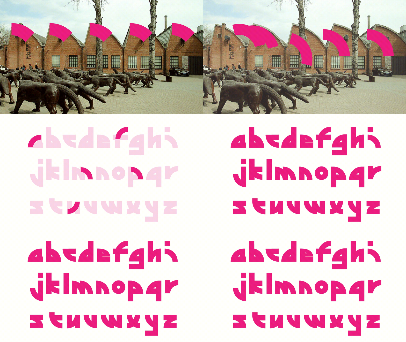
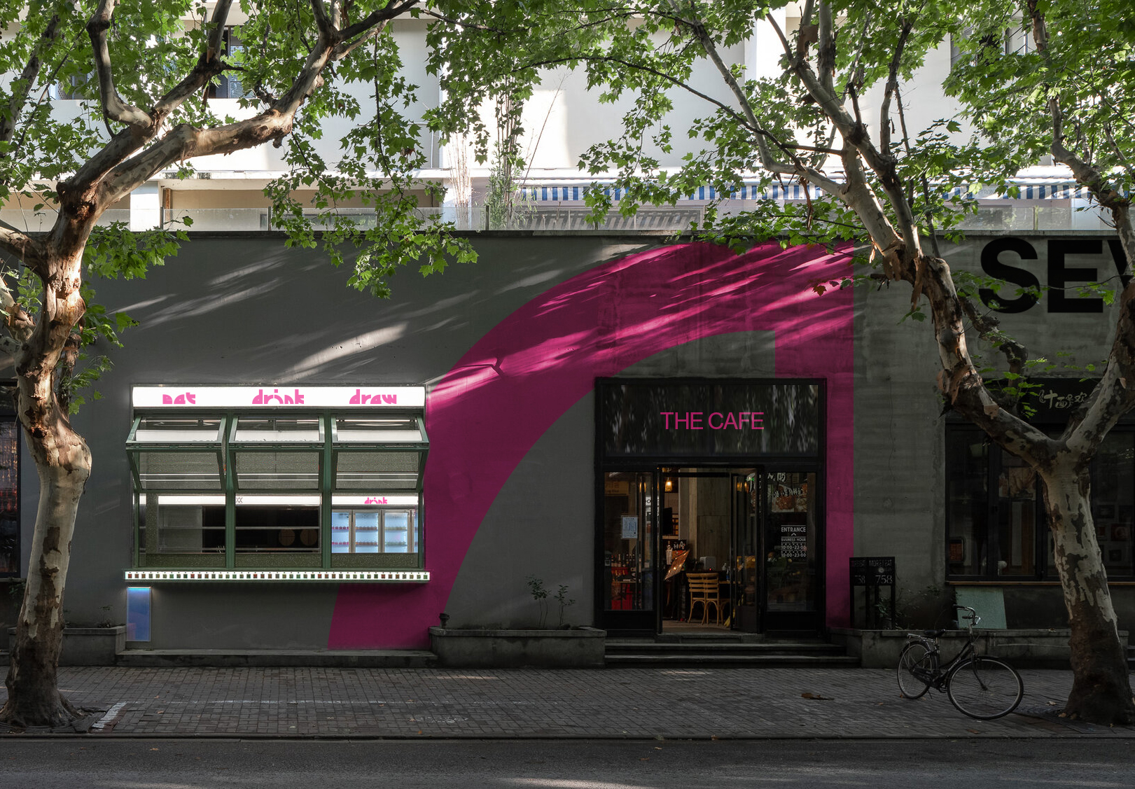
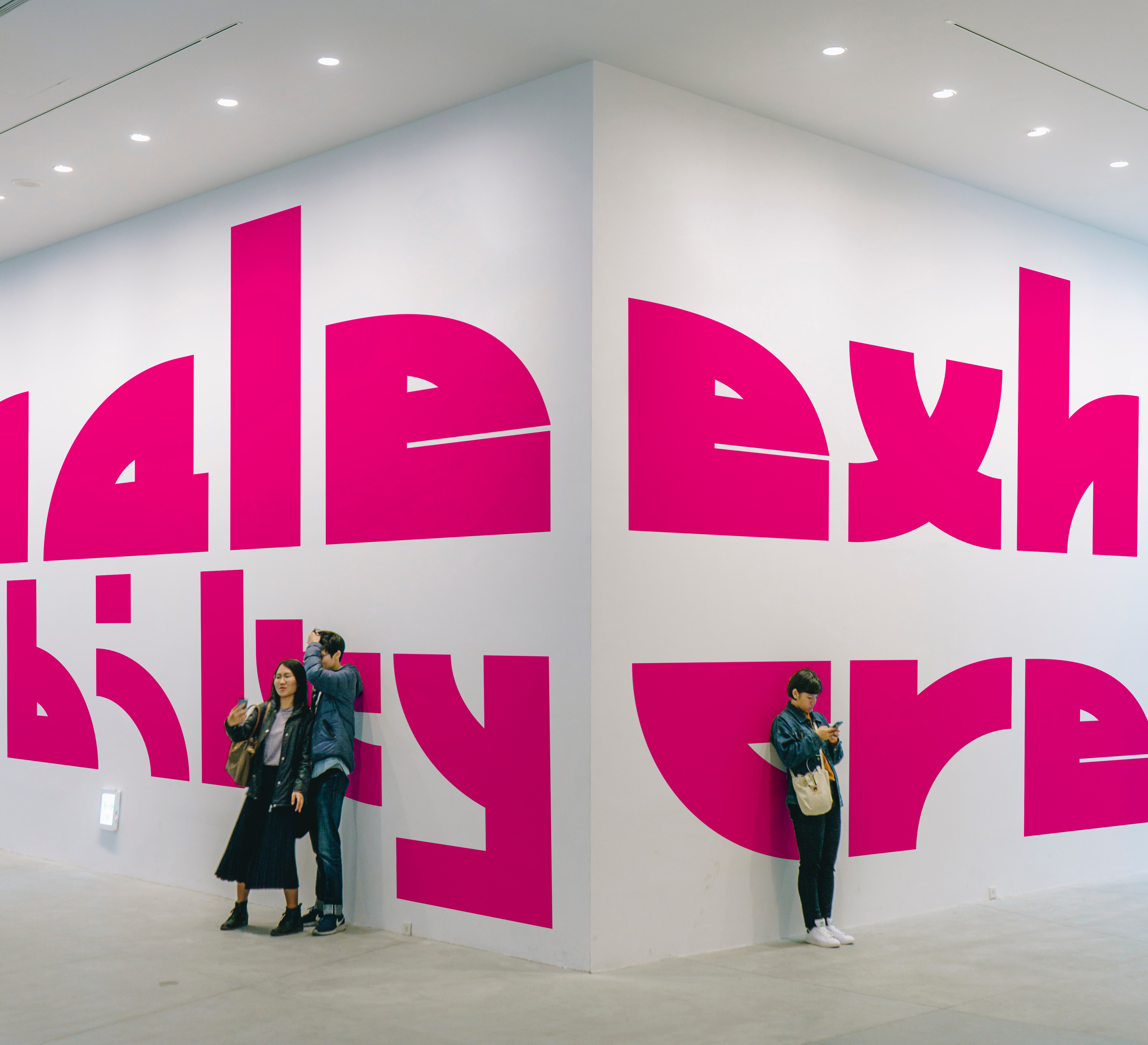
The display typefaces draw inspiration from an iconic building in the district, known for its fascinating curved roofs.
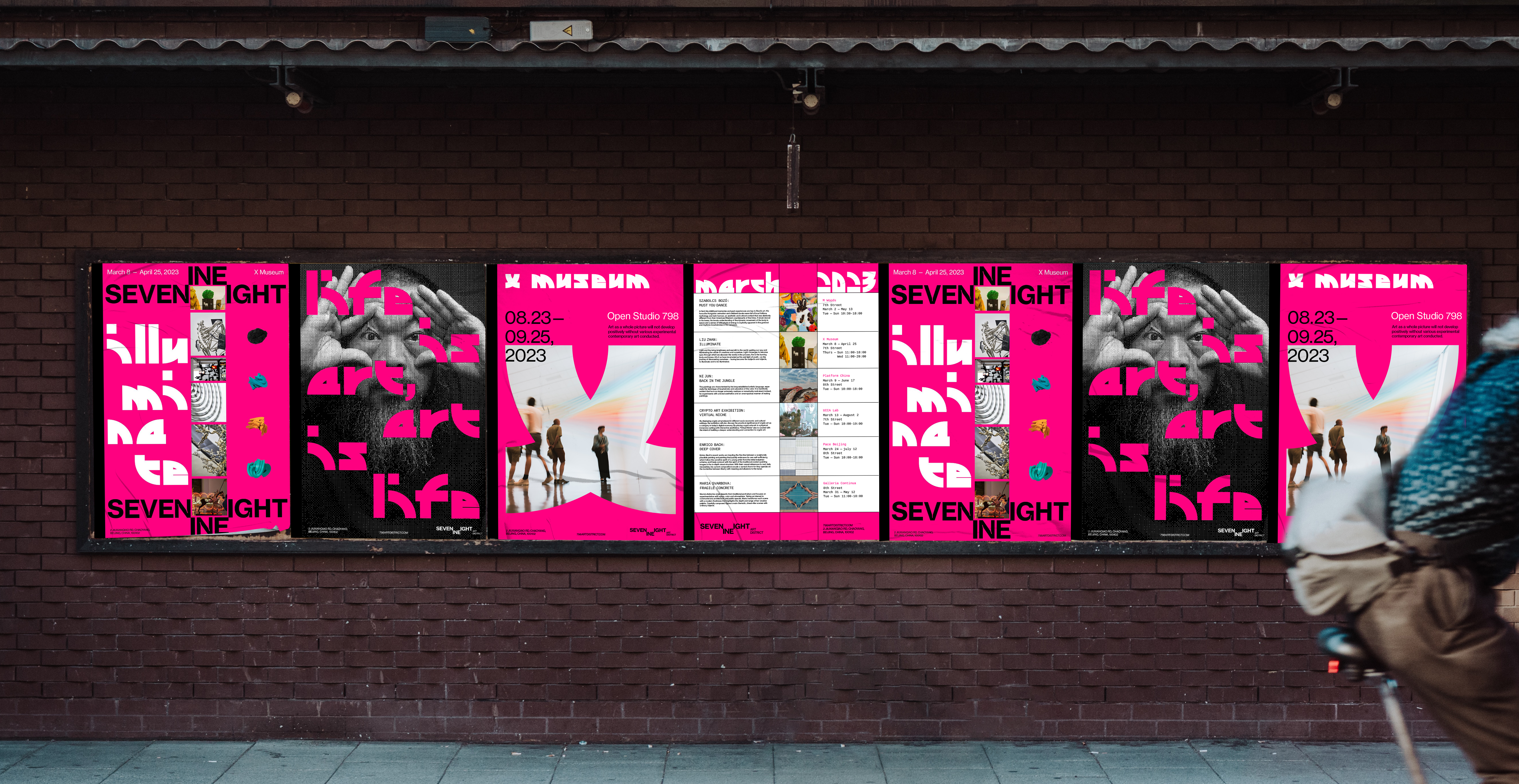
(Poster Series)
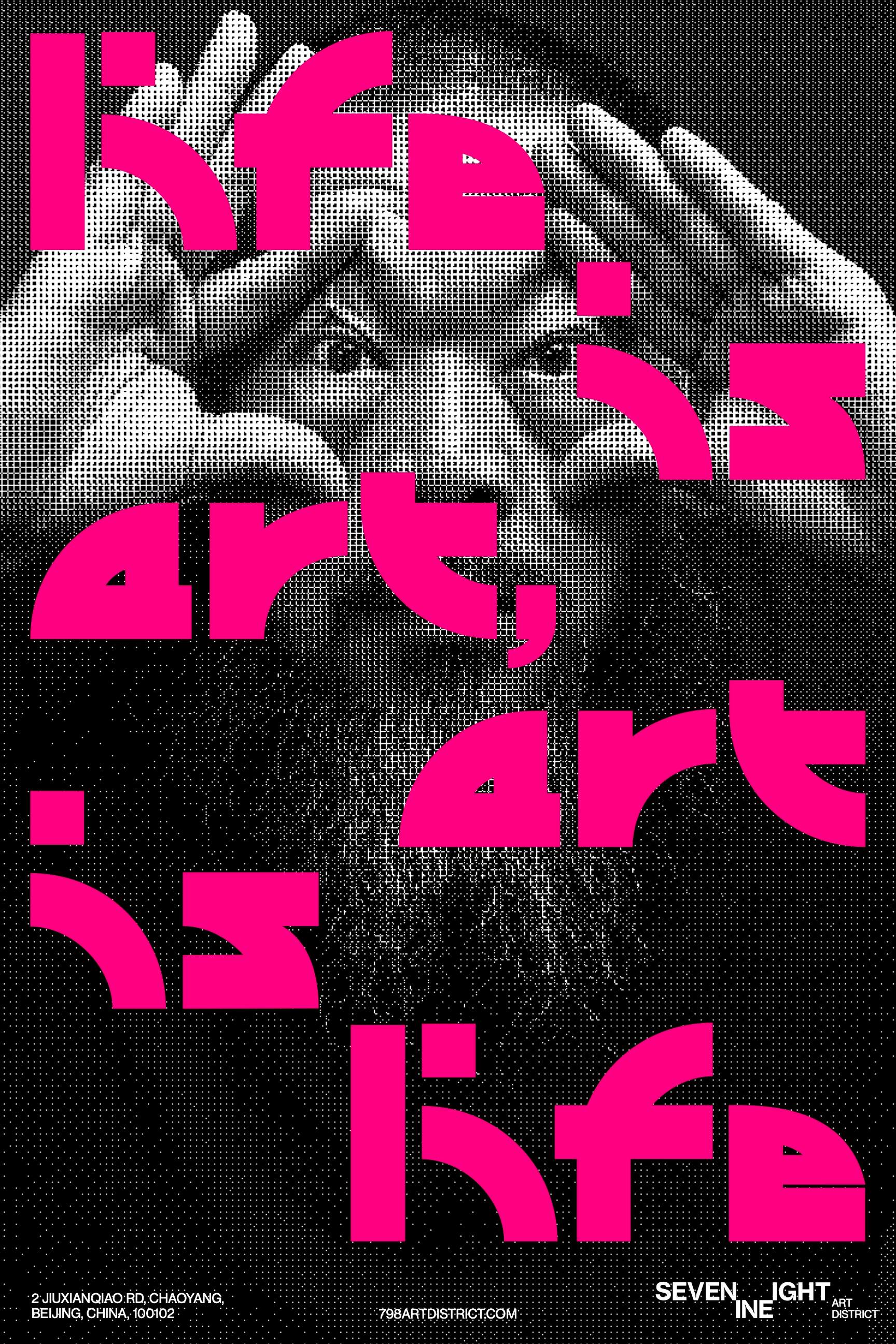
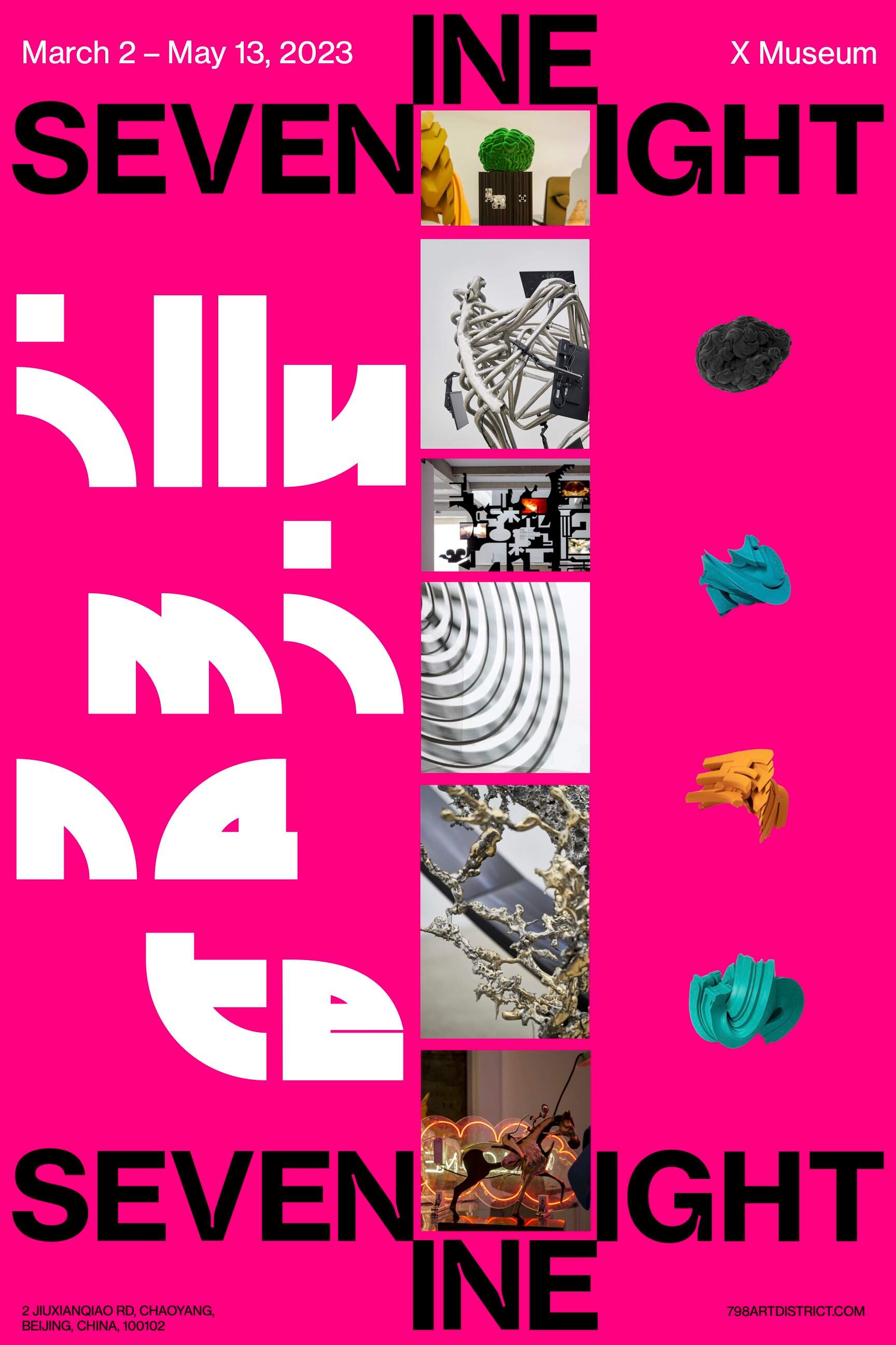
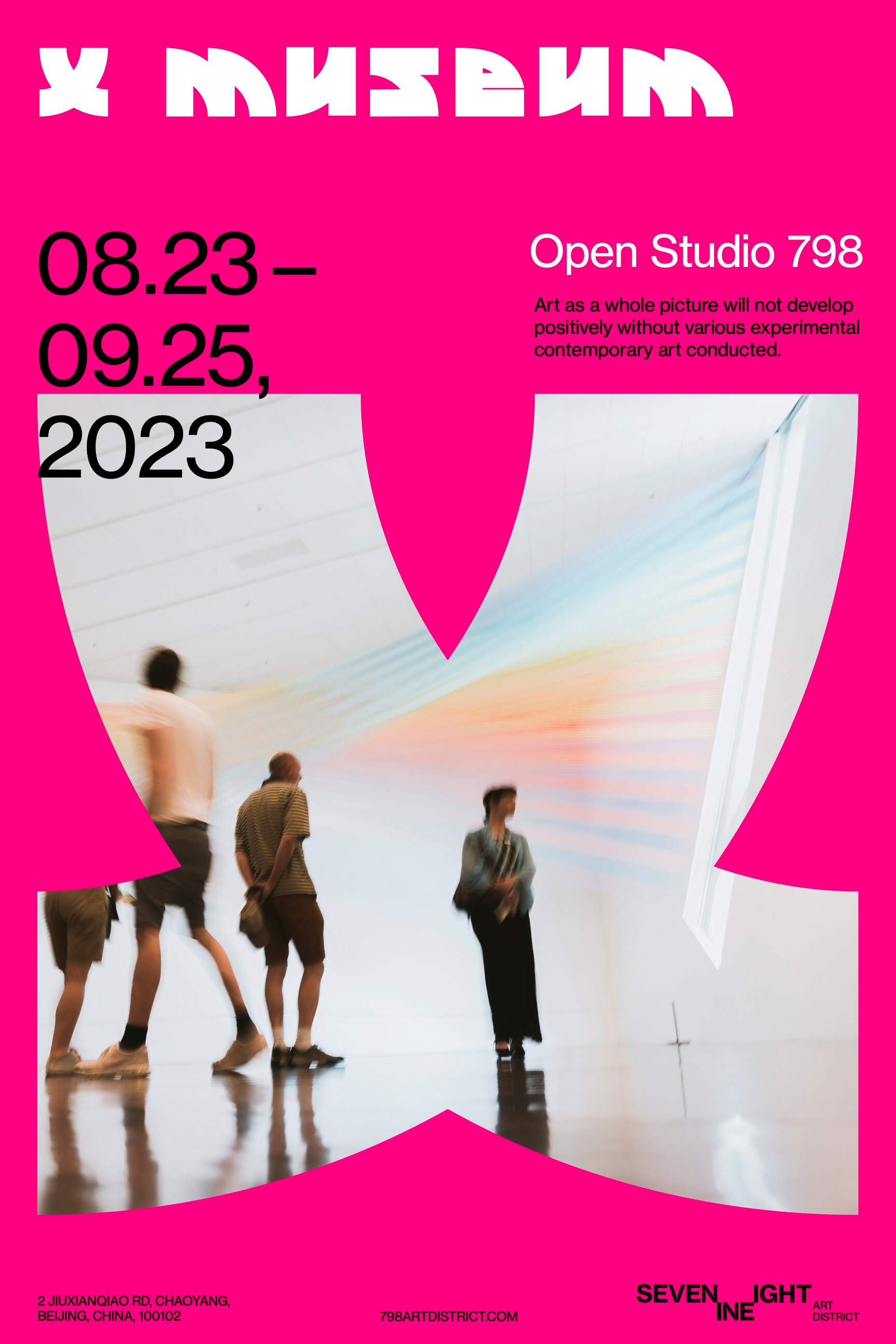

Poster Series leverages a grid system derived from its logo, ensuring visual consistency and continuity across the series.
(Brochure)
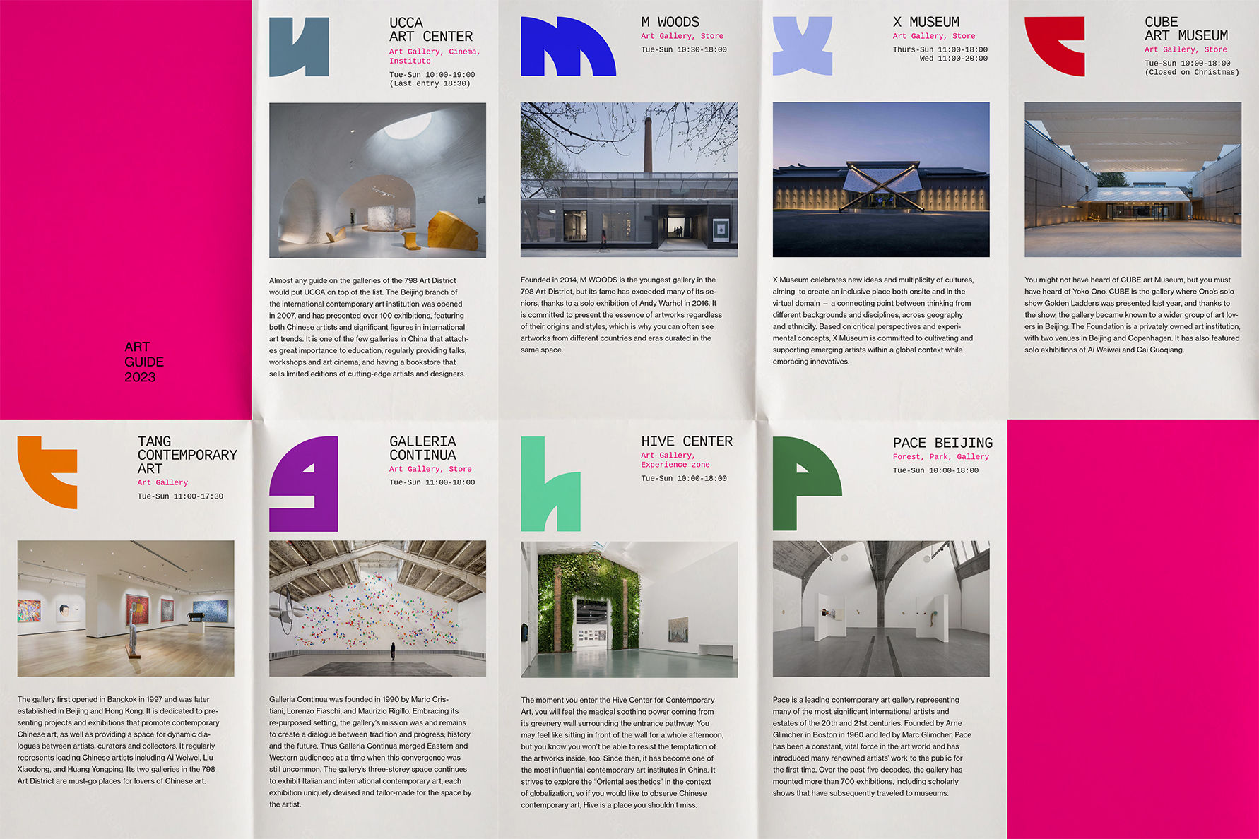
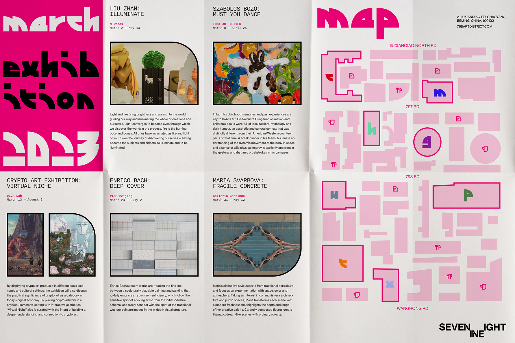
The brochure is to enhance visitors’ experience. They can explore the special exhibition of the month and discover the featured galleries. The display typefaces represent each gallery and are also featured on the map for easy navigation.
(Web)
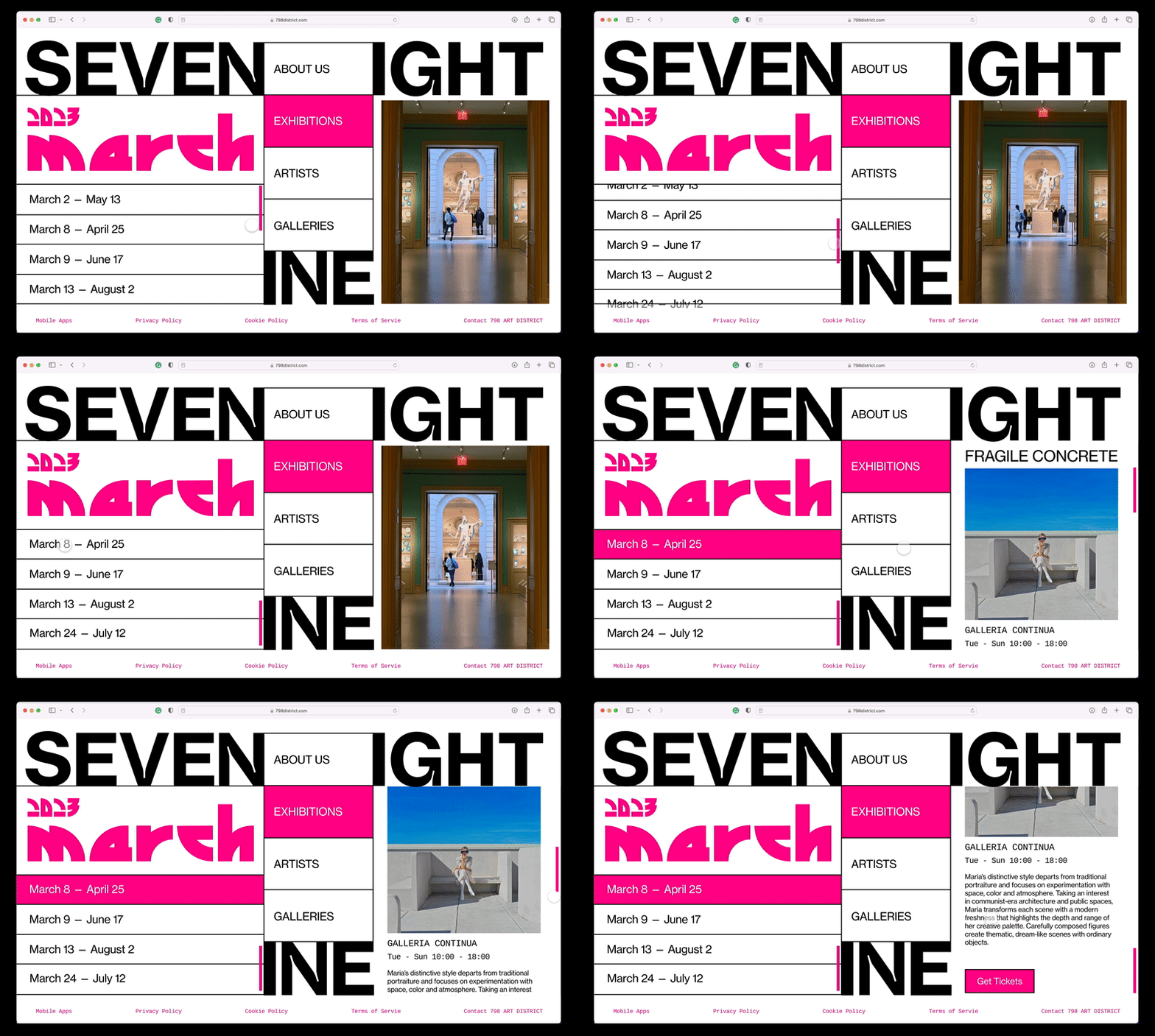
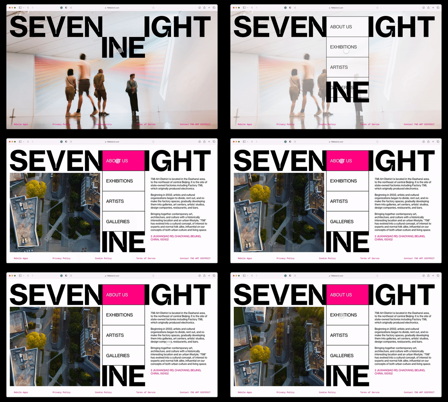
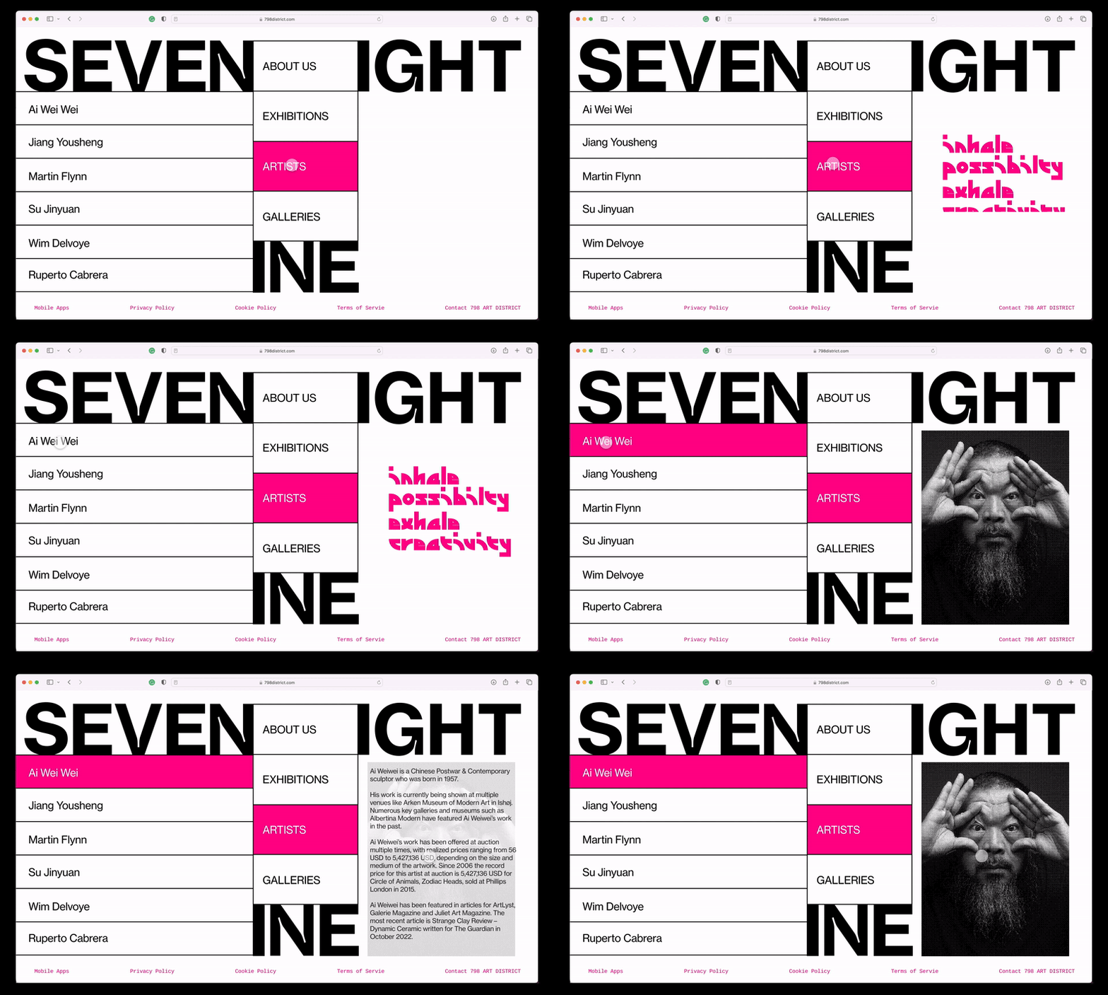
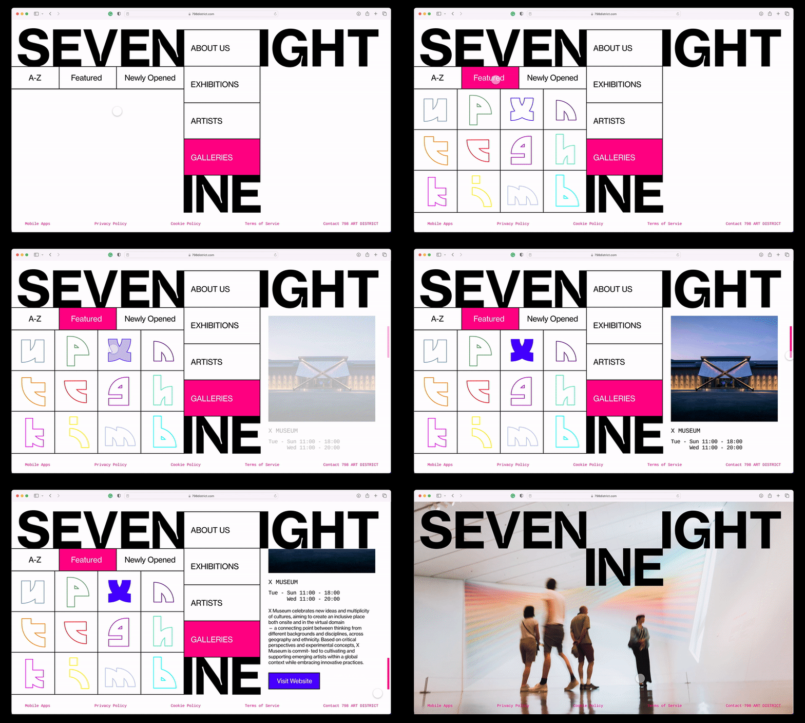
The website demonstrates the logo's transformability, showcasing how the movement of "INE" is creatively utilized on digital media.
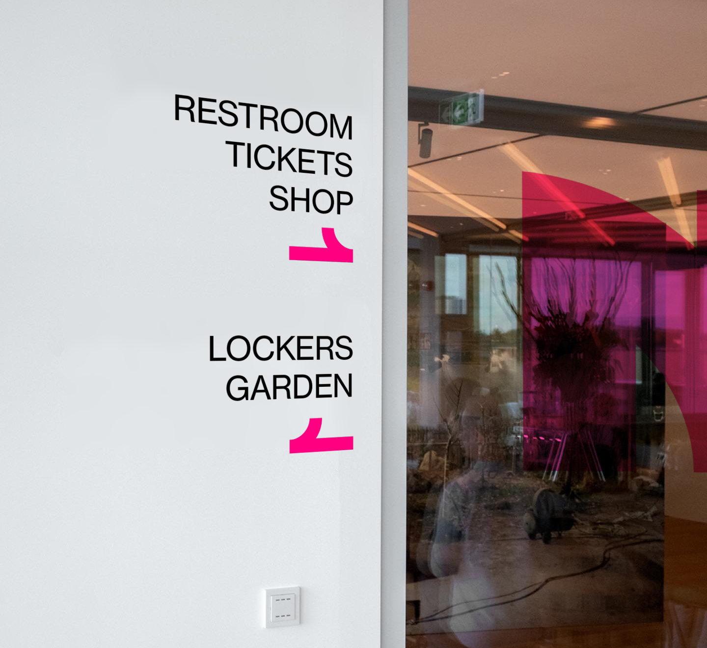
(Environmental Graphics)
