PPL MAGAZINE
Magazine Design
︎︎︎Branding
︎︎︎Environmental Graphics
![]()
The new PEOPLE MAGAZINE offers readers a diverse array of experiences and stories from individuals around the world, instead of focusing solely on gossip. Each issue focuses on a specific theme that unites people from all walks of life, providing an opportunity for readers to foster empathy and understanding. Through this magazine, readers can explore the commonalities that connect us all.
(Logo)
︎︎︎Environmental Graphics
The new PEOPLE MAGAZINE offers readers a diverse array of experiences and stories from individuals around the world, instead of focusing solely on gossip. Each issue focuses on a specific theme that unites people from all walks of life, providing an opportunity for readers to foster empathy and understanding. Through this magazine, readers can explore the commonalities that connect us all.
(Logo)
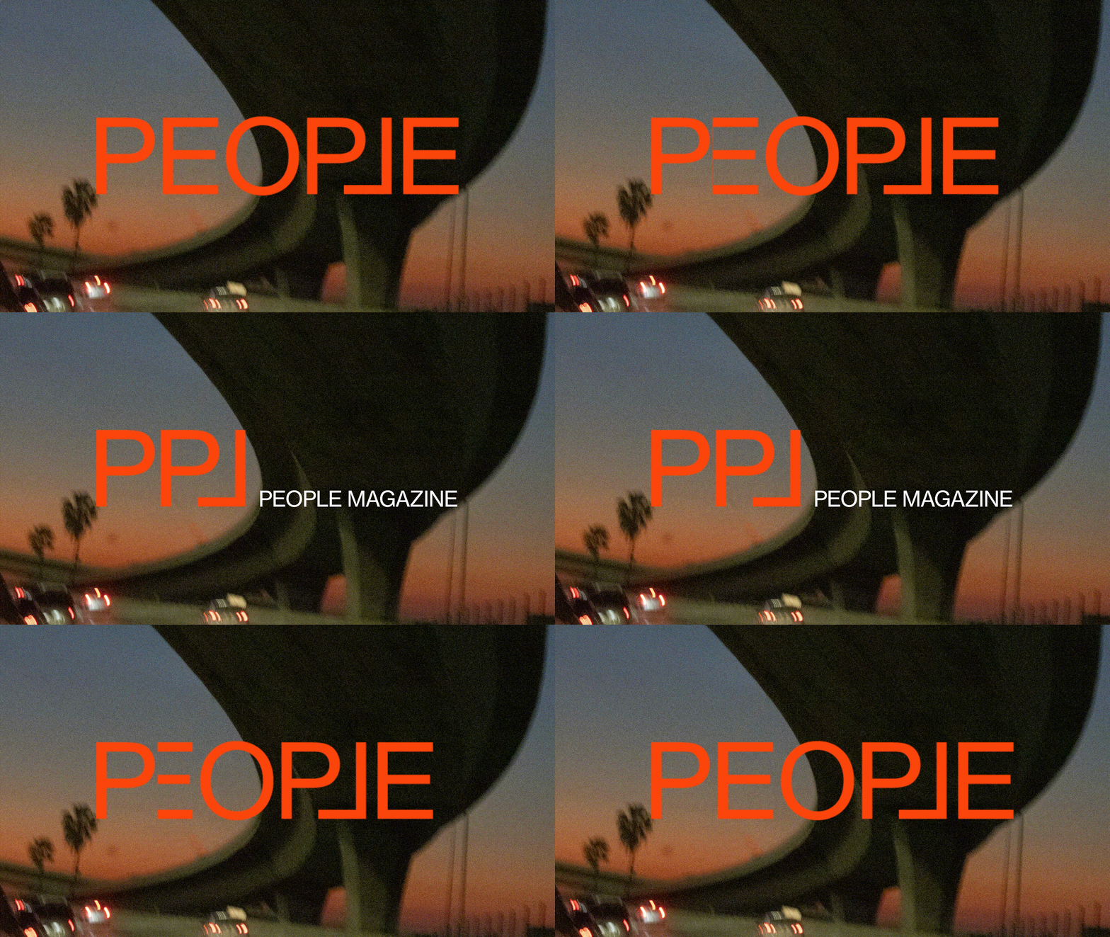
The new magazine's logo incorporates a flipped L, which forms a stable frame and visually encapsulates the other characters. This design element aligns perfectly with the three keywords that define the magazine: "universal, empathy, and humane."
(Magazine)
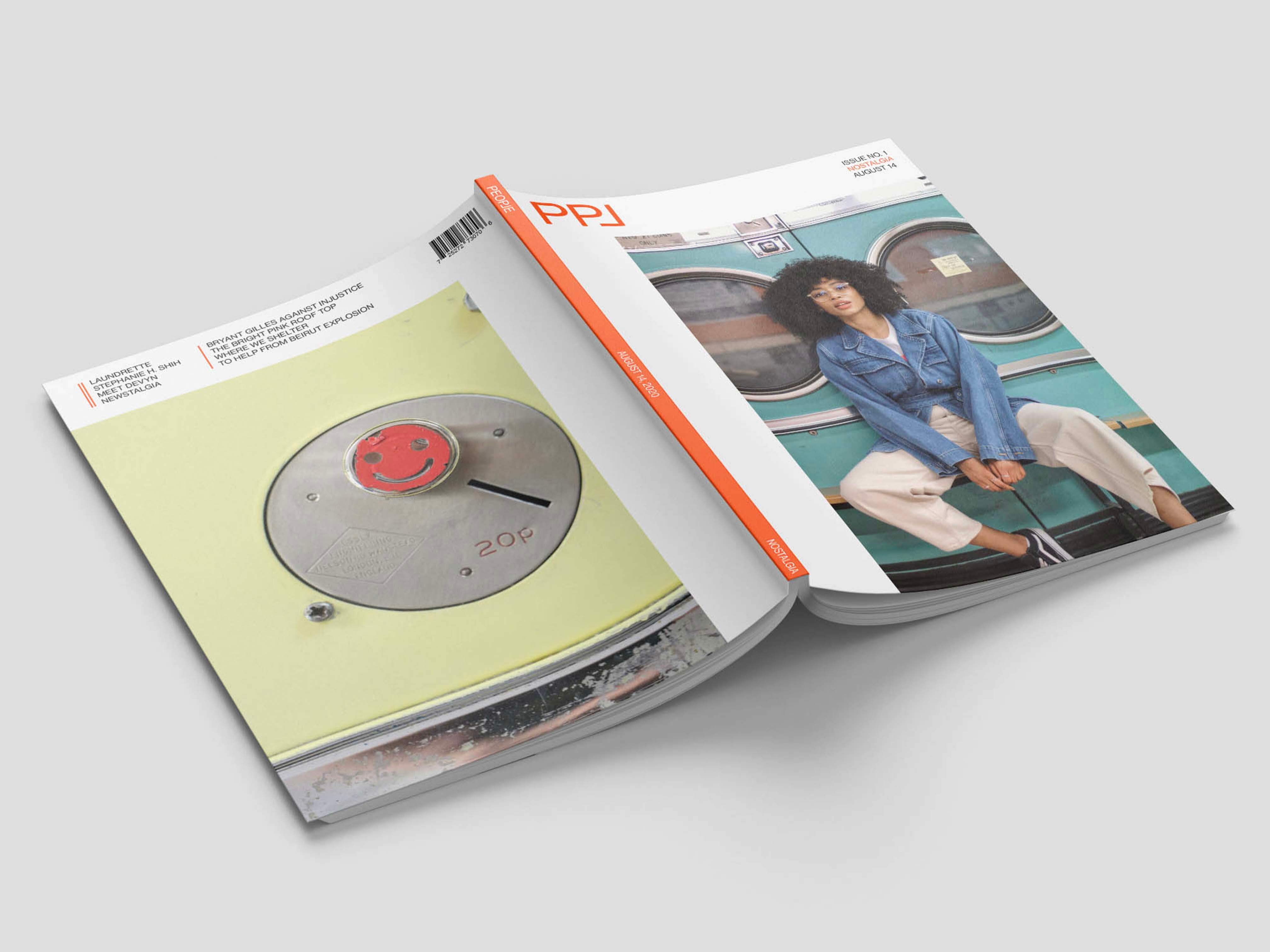
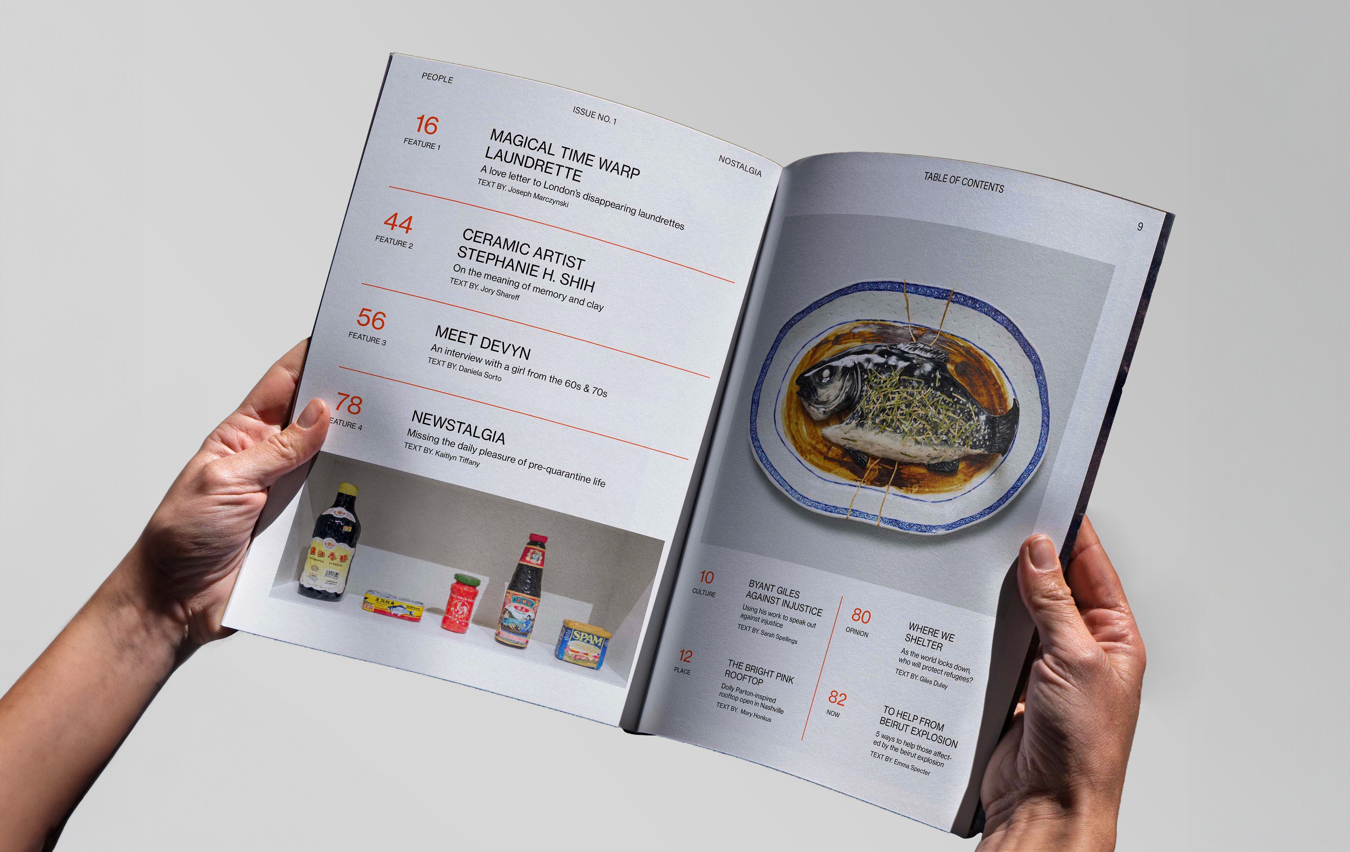
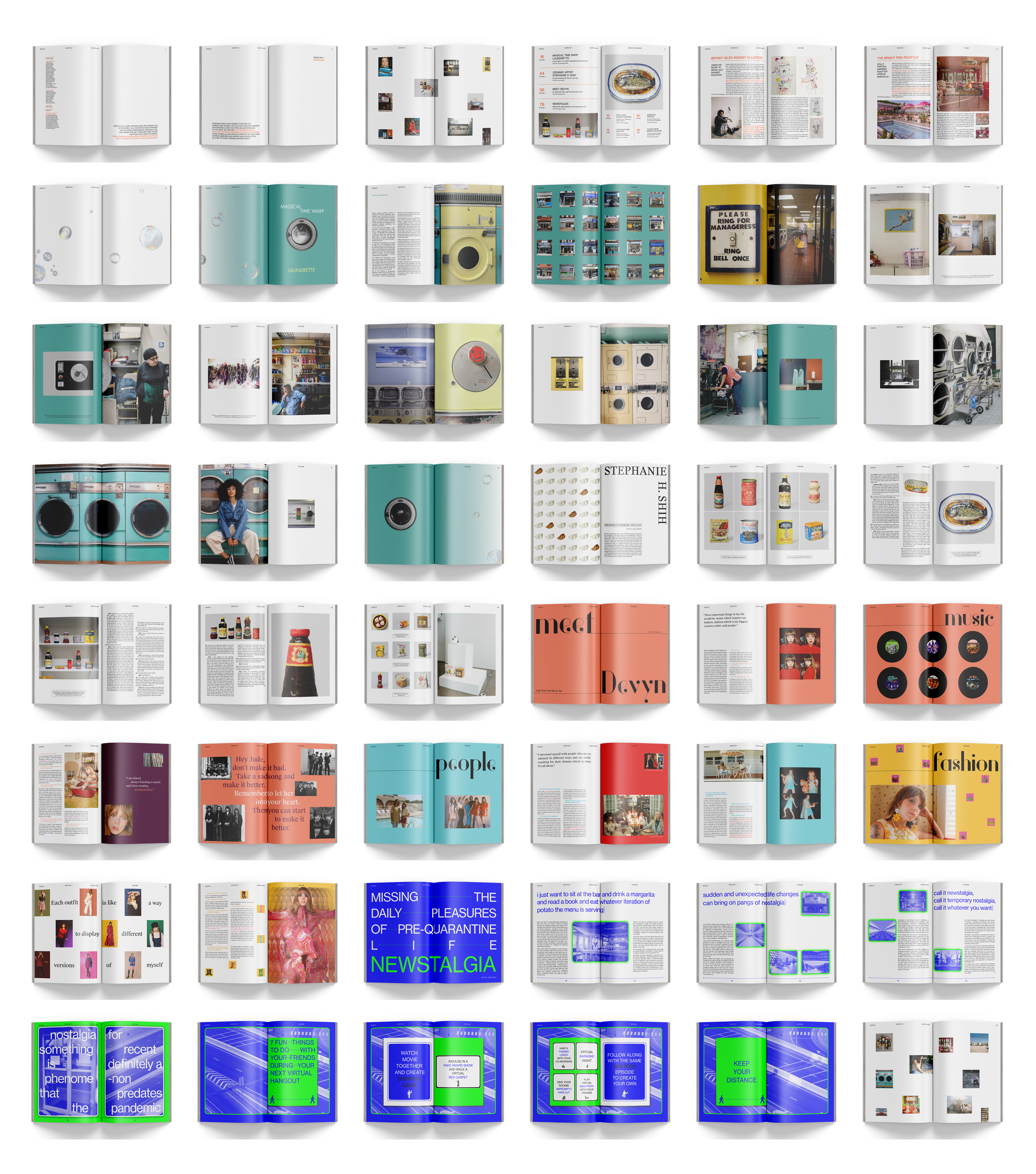
The magazine delves into the universal yearning for a bygone era in one's life—a desire often referred to as nostalgia. Readers will explore cherished memories and experiences from the past, evoking a sense of longing and reflection that resonates with everyone.
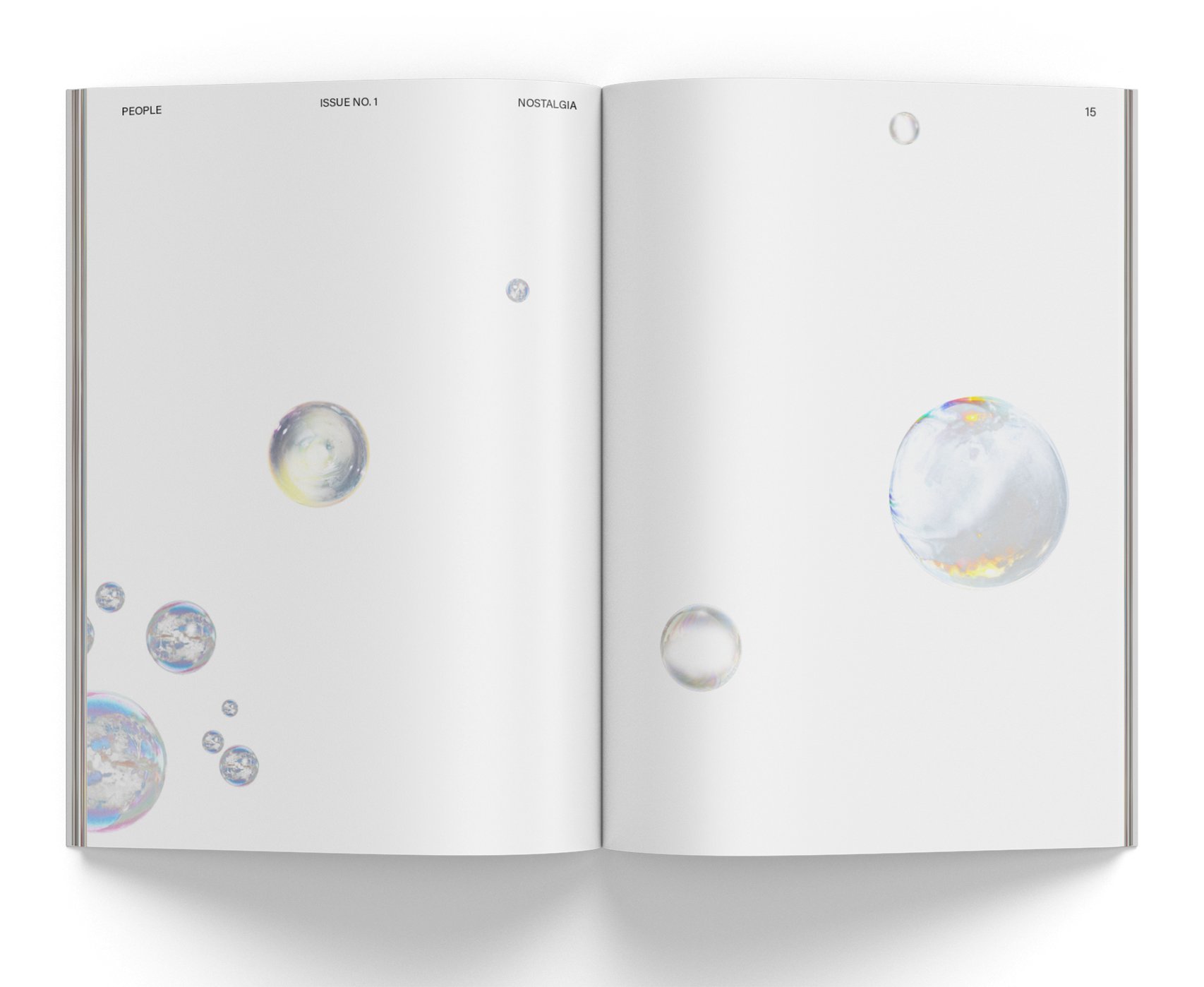
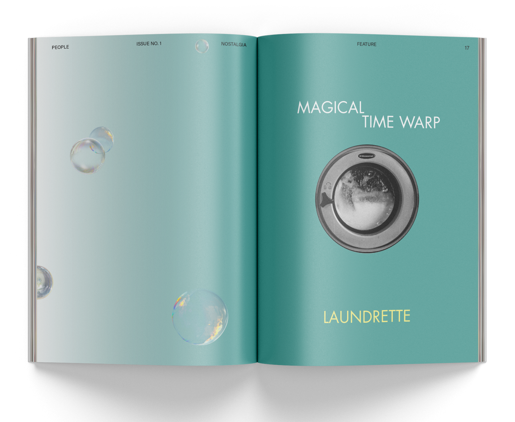
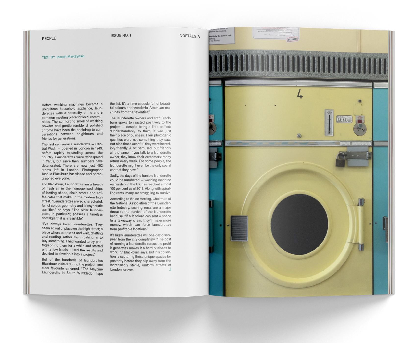
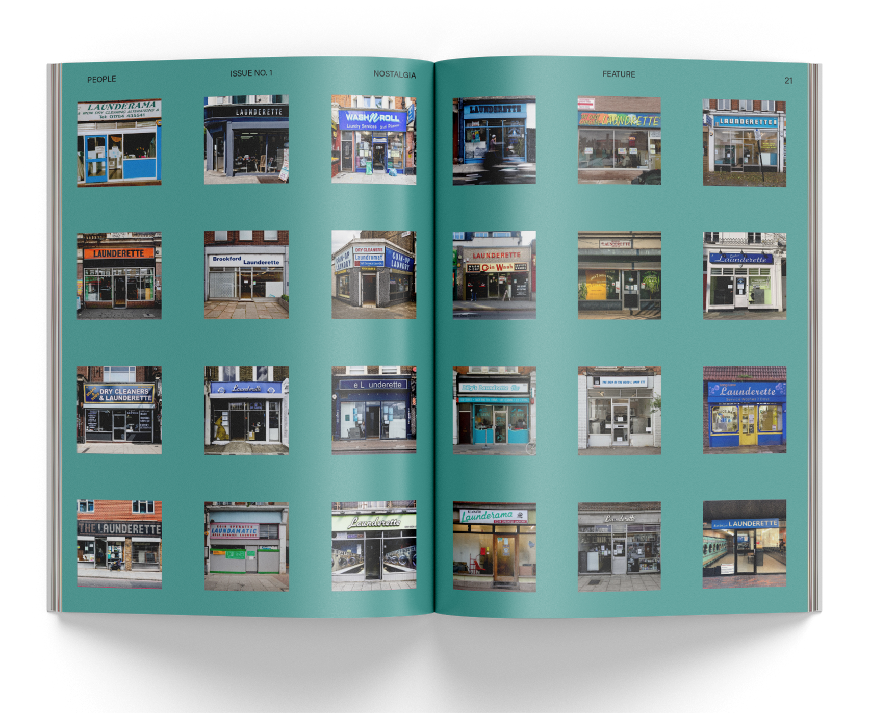
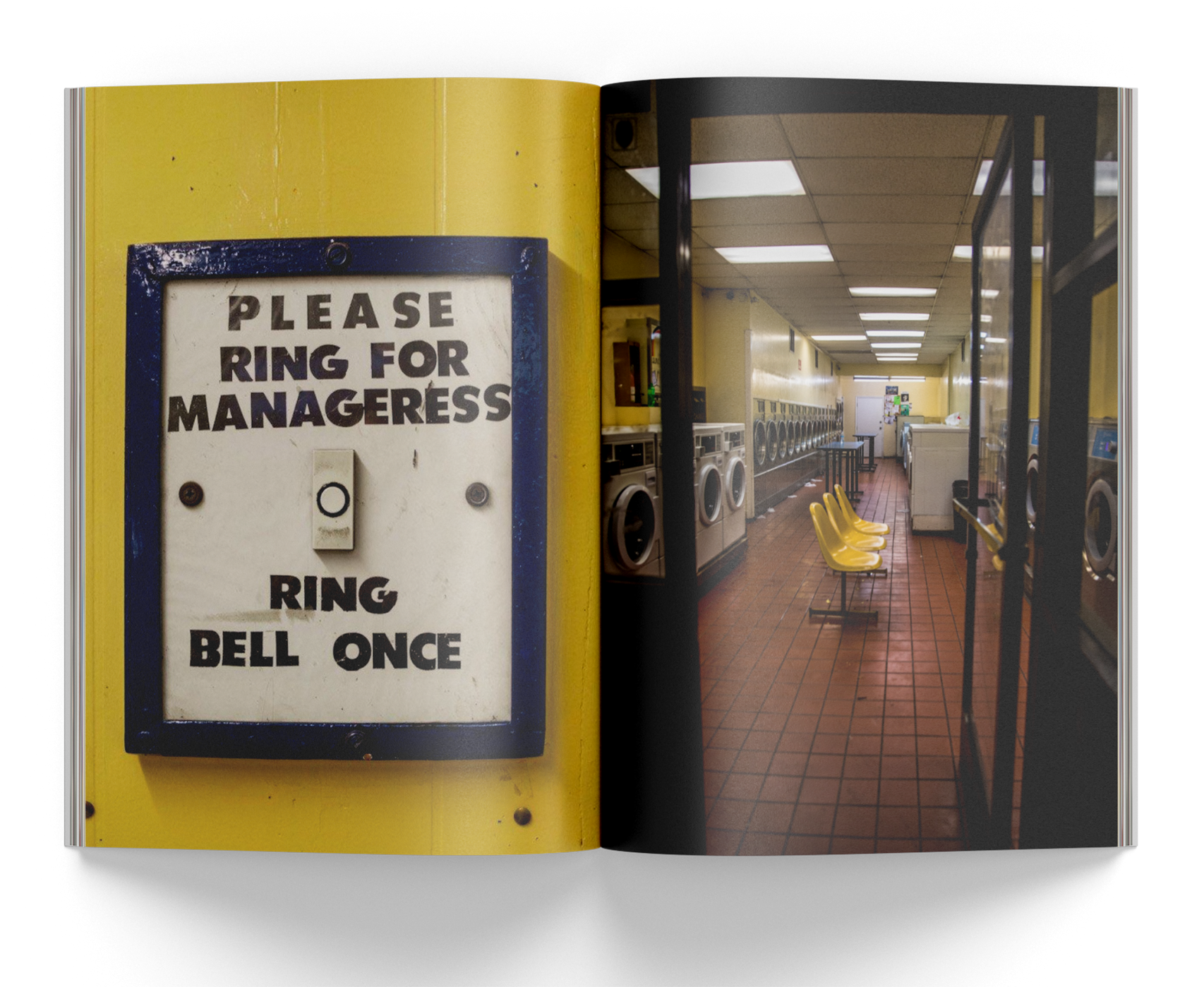
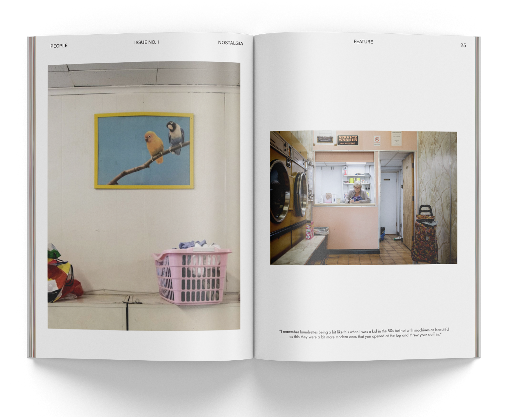
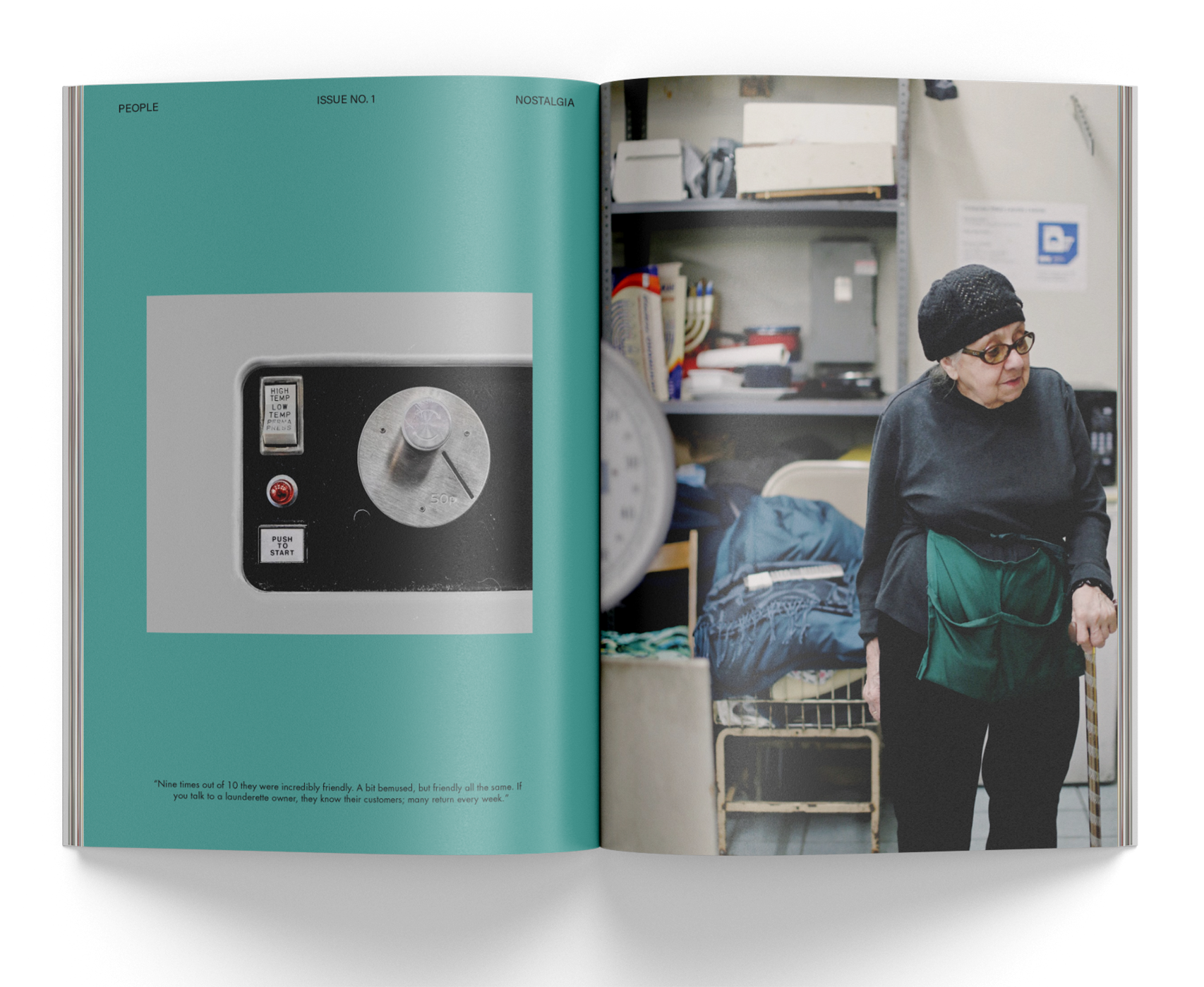
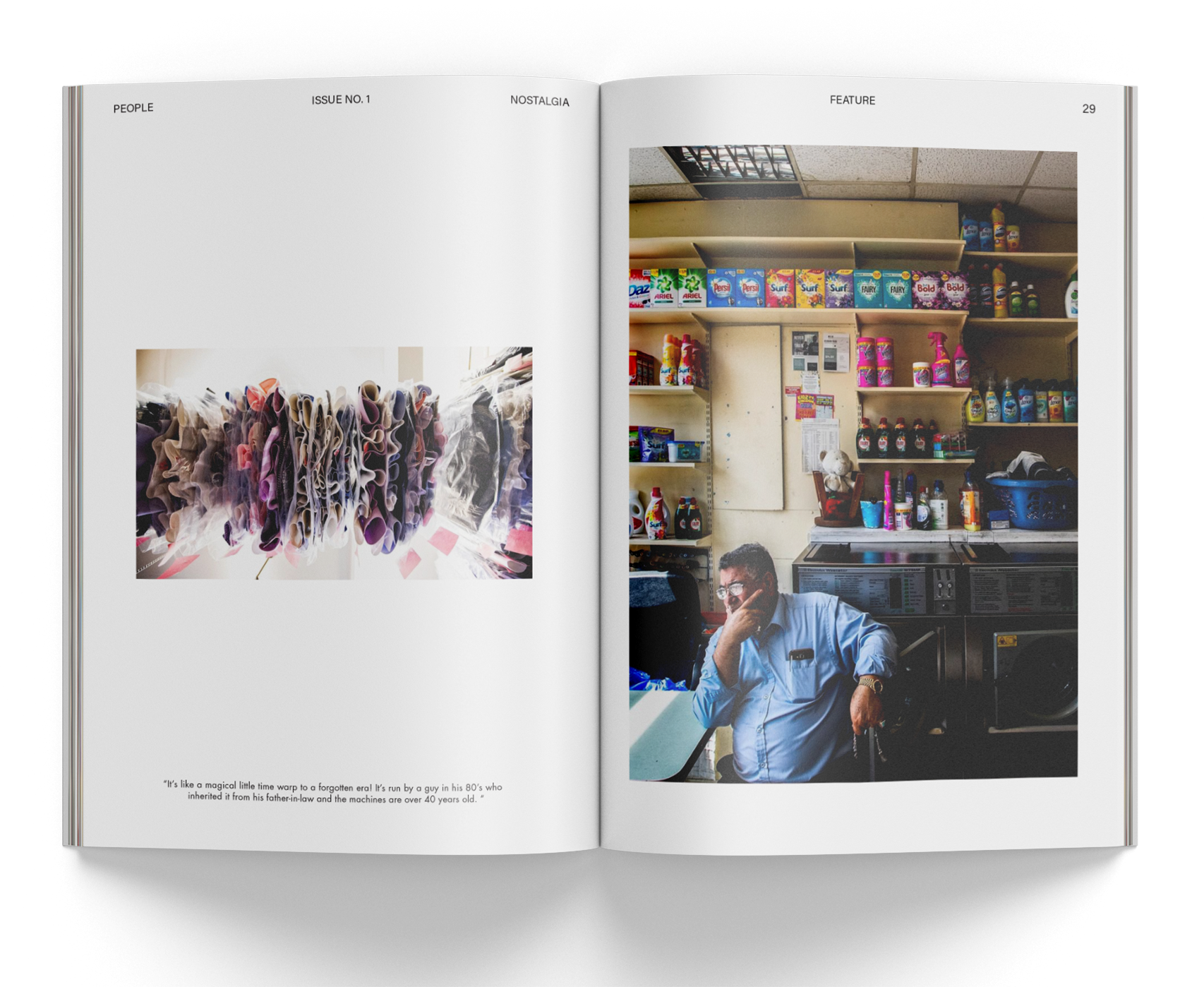
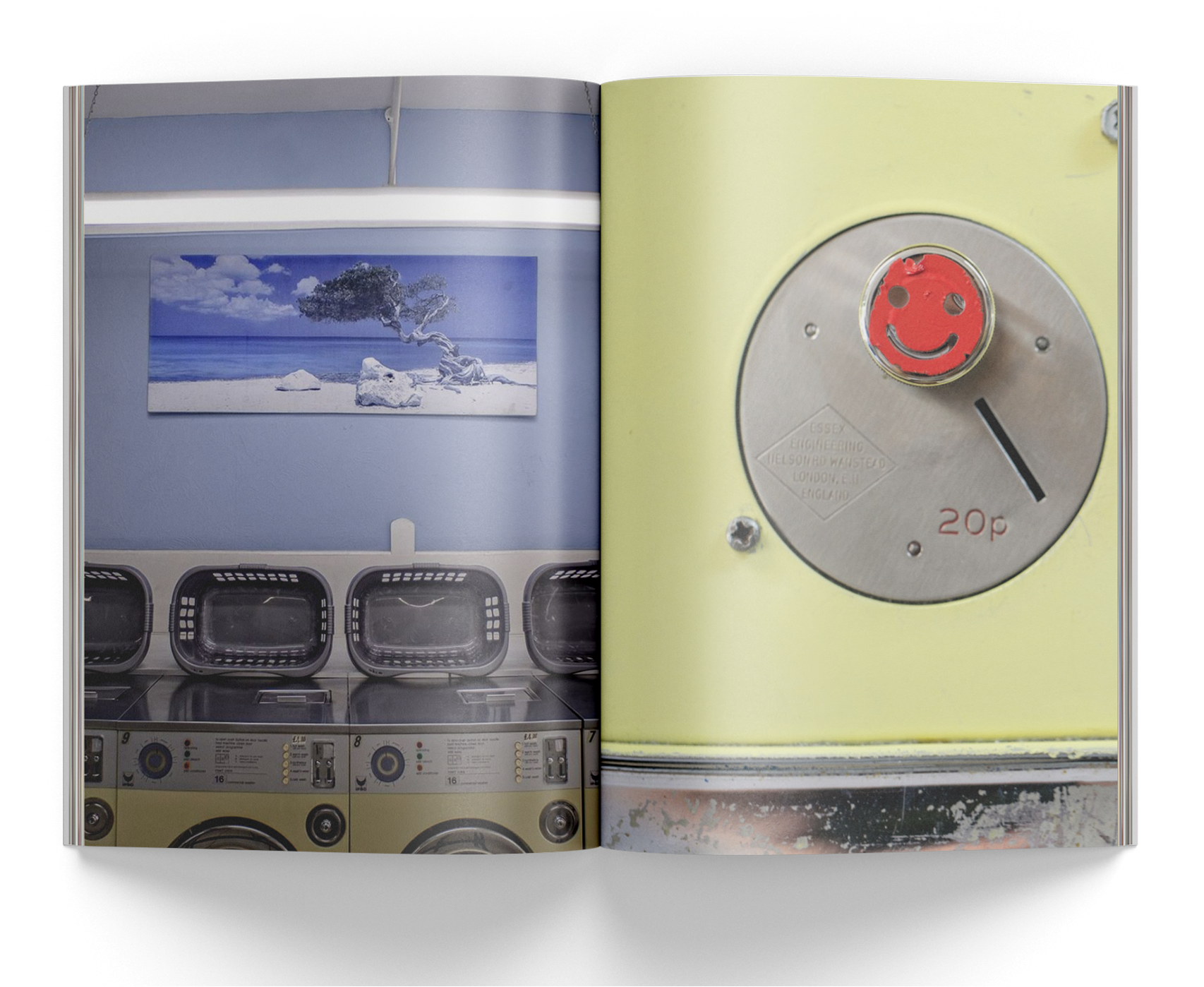
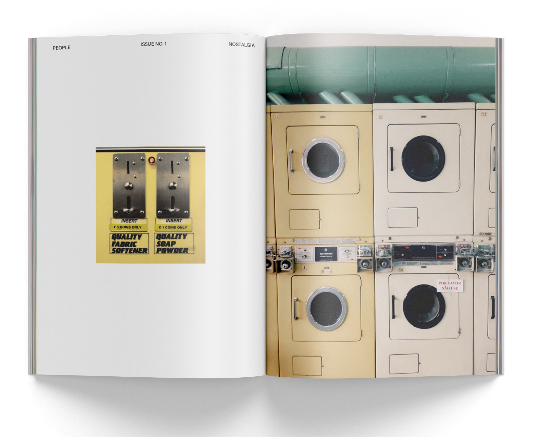
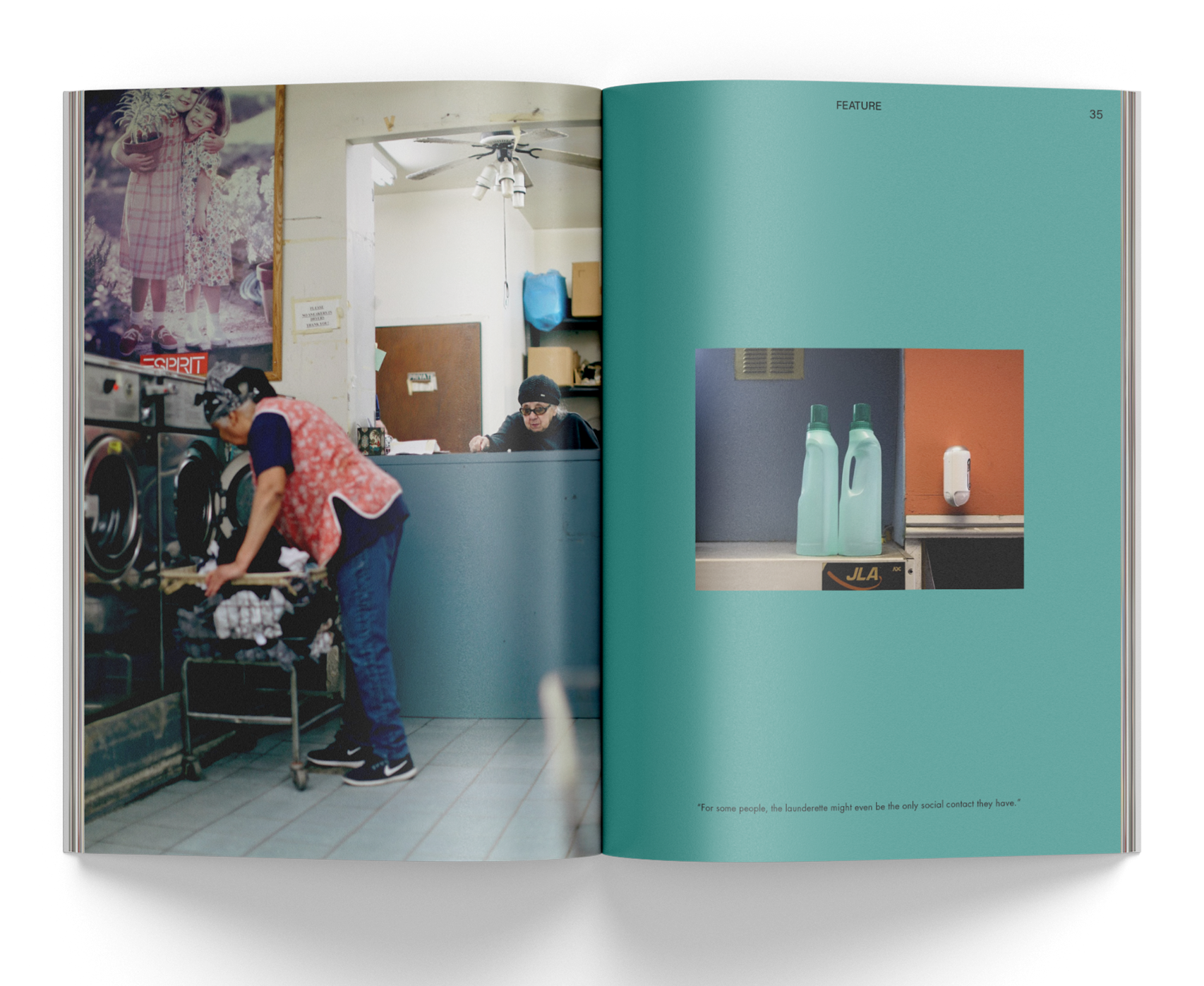
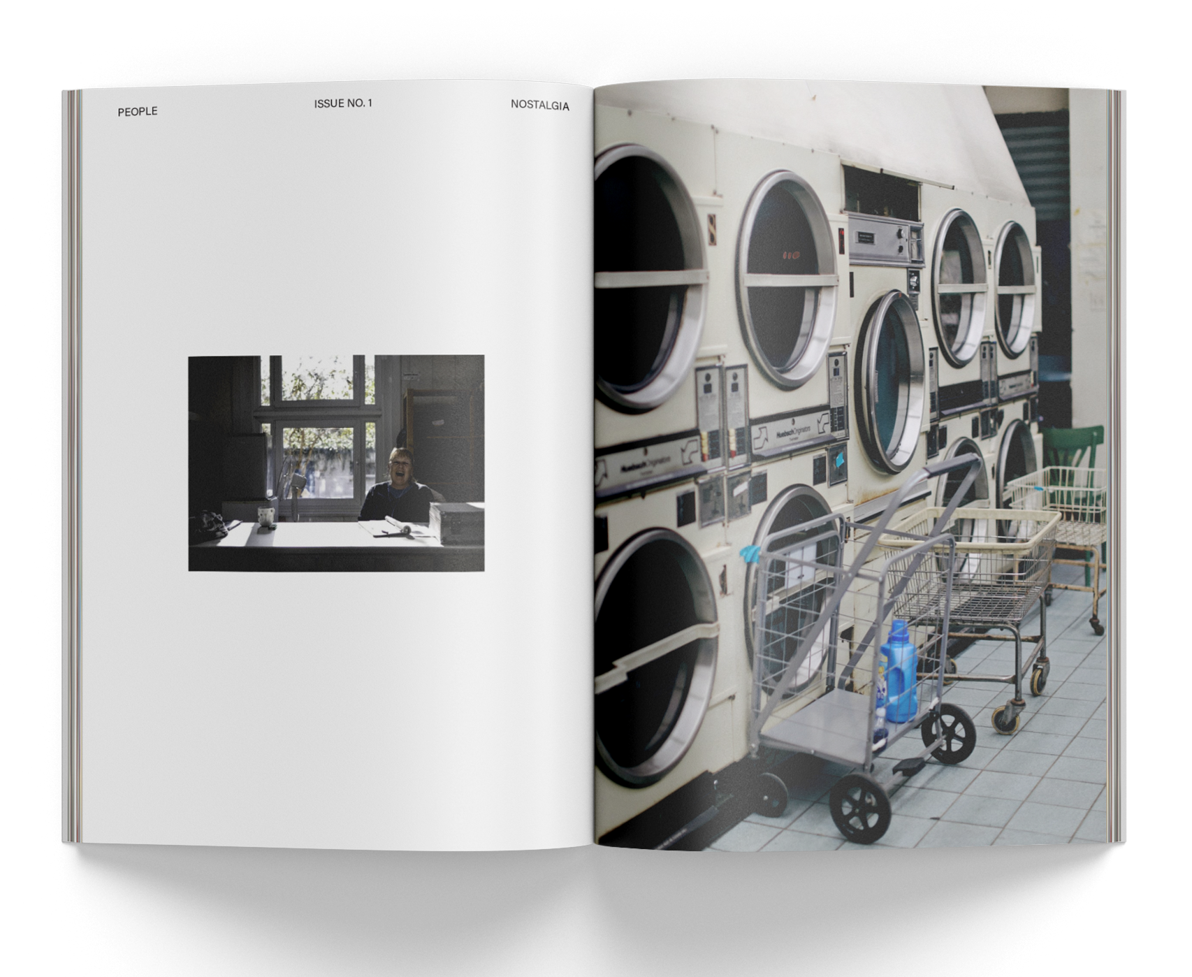
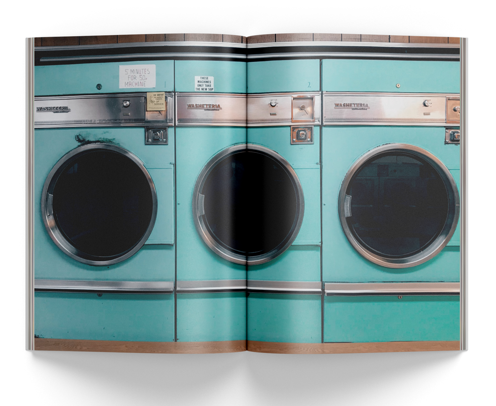
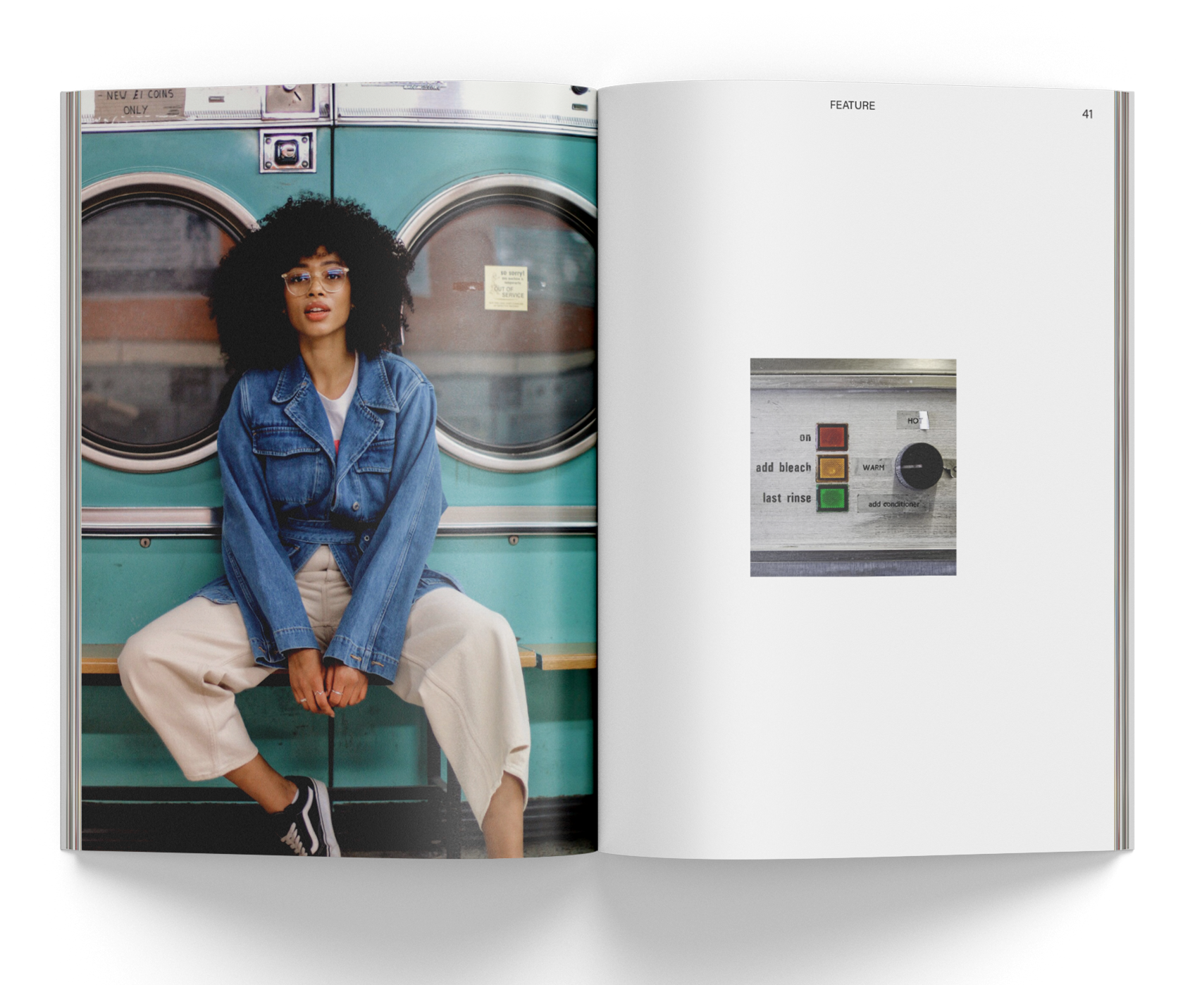
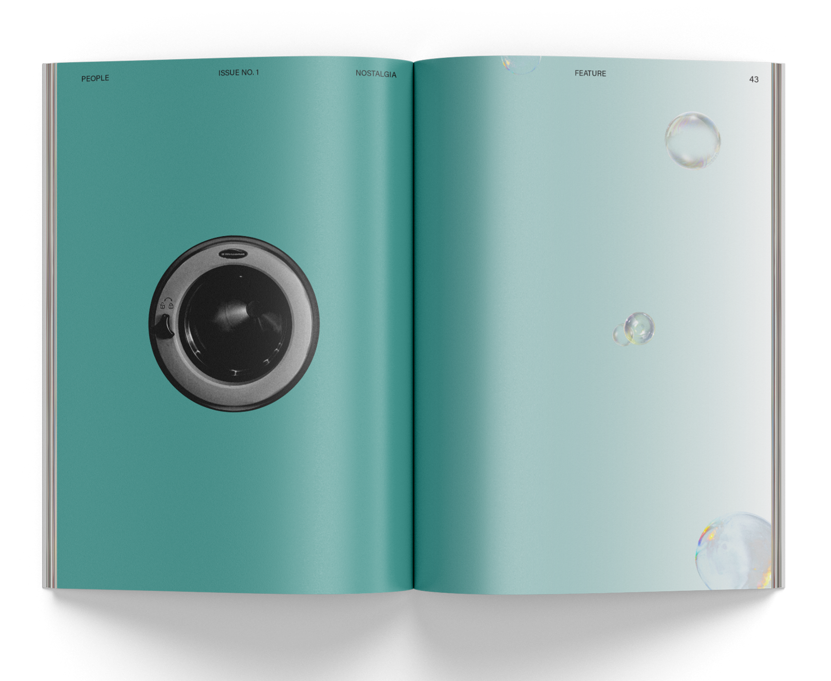
The first article features a captivating photo essay, celebrating the disappearing laundrettes' enduring value and beauty. The carefully curated photographs transport readers to these charming locations, immersing them in the essence of nostalgia. The use of breathing spaces in the layout enhances the overall experience, evoking the authentic charm and sentimentality of these once-thriving establishments.
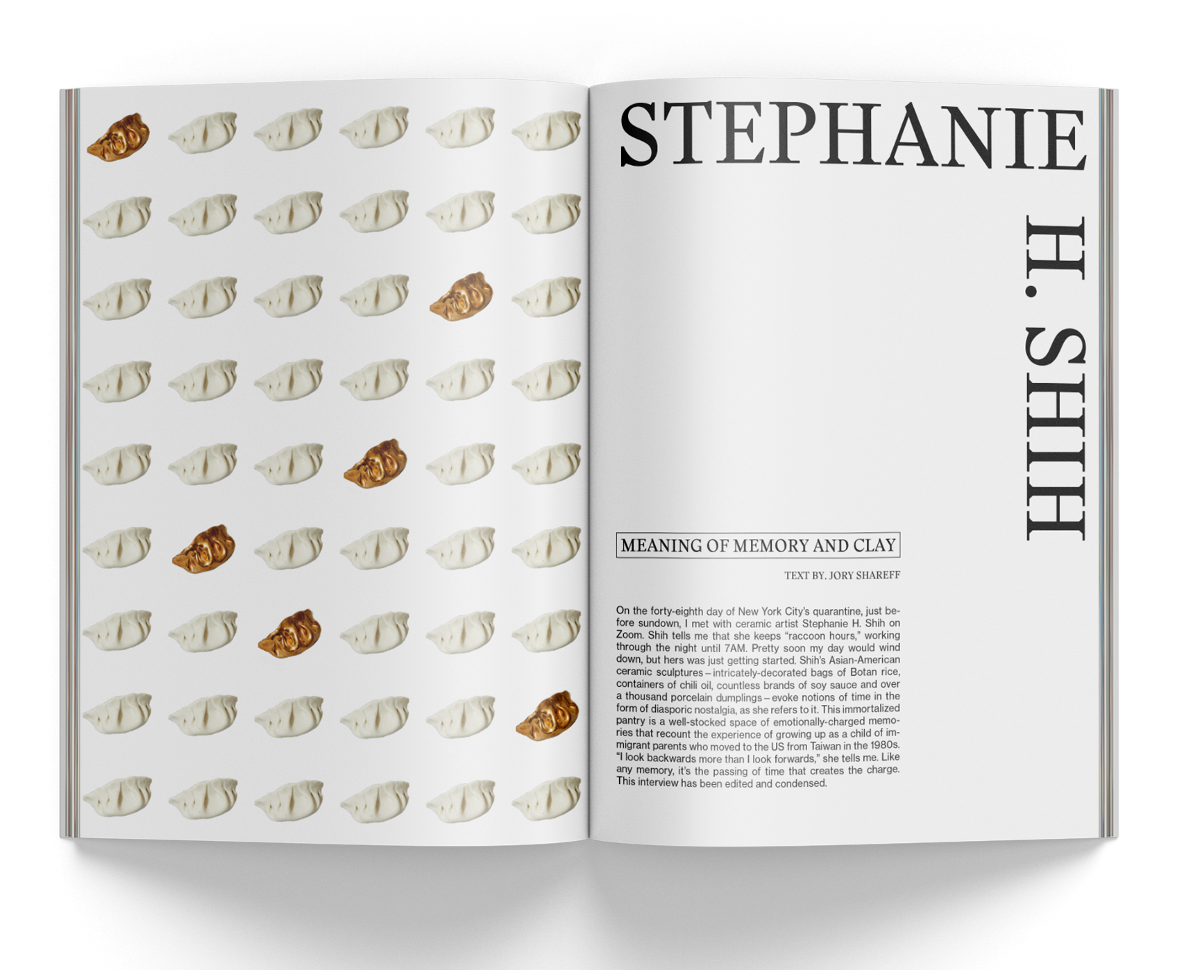
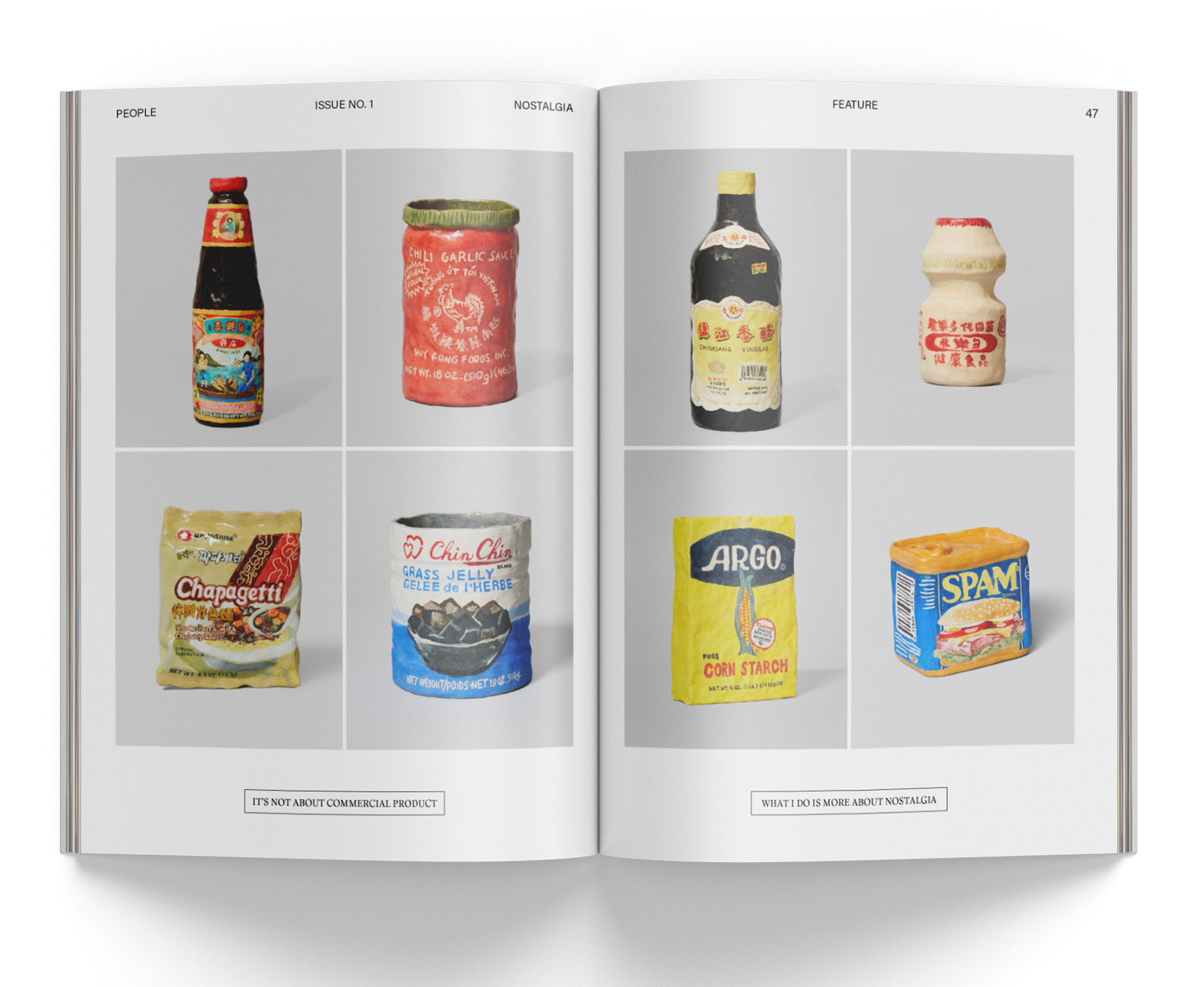
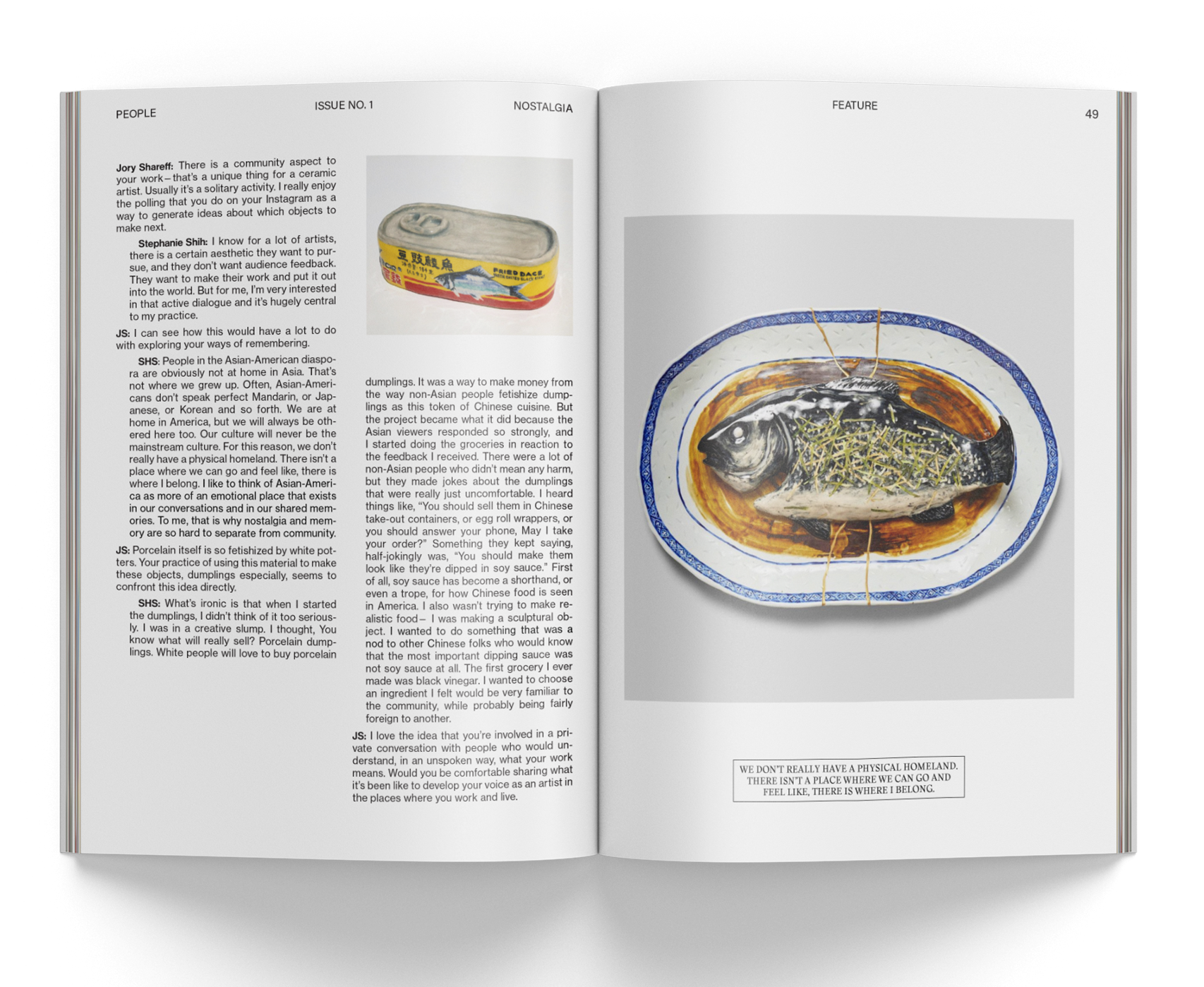
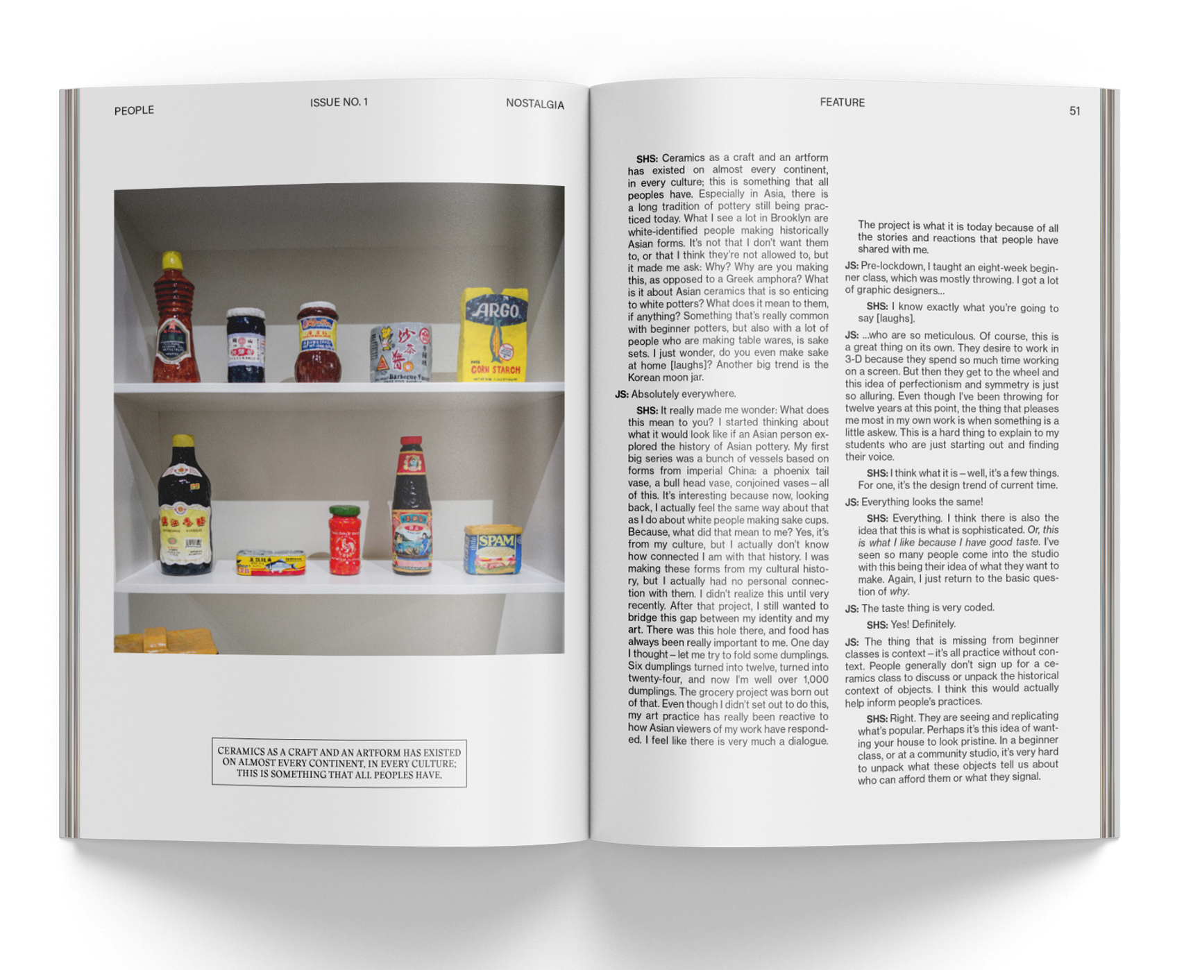
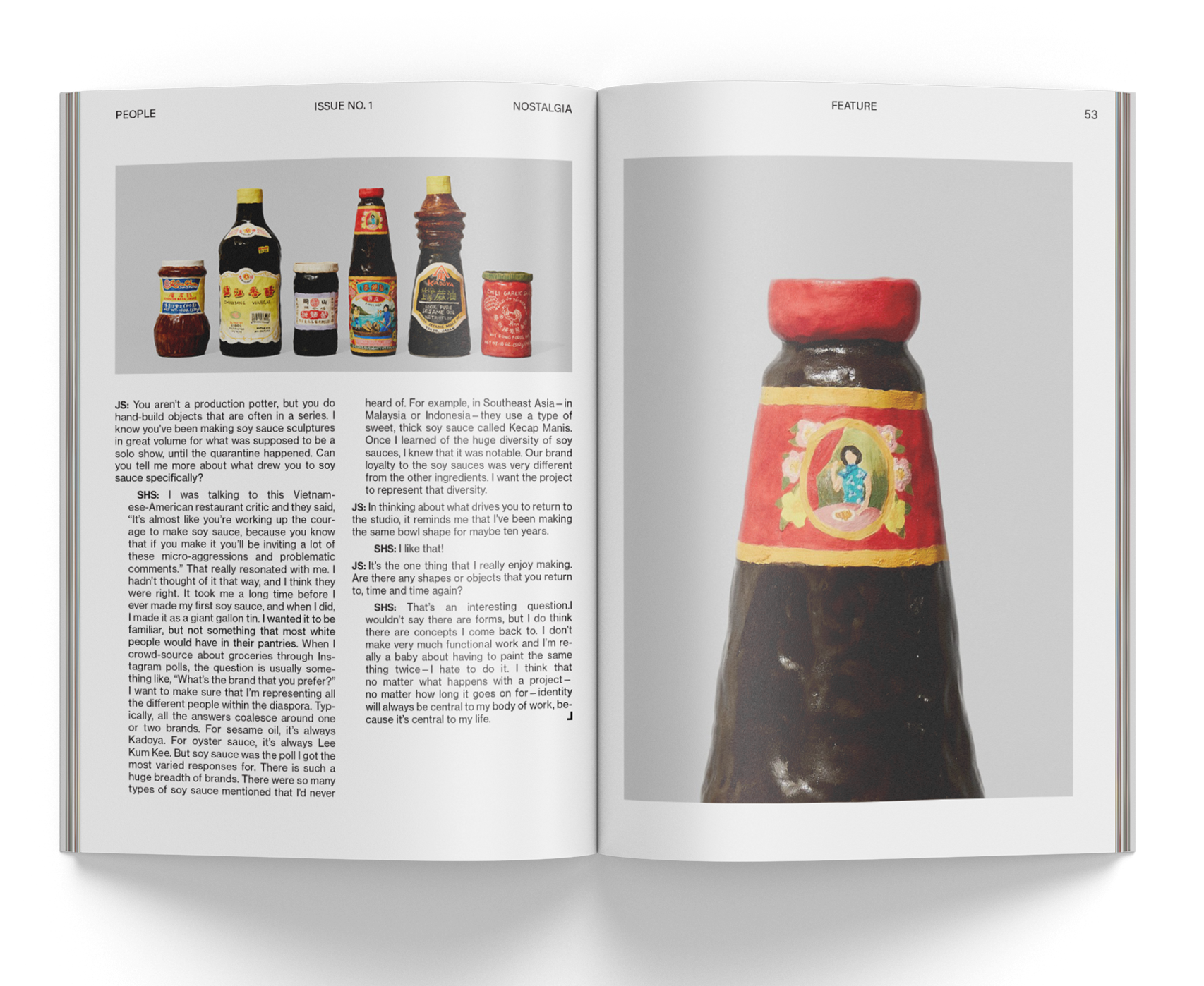
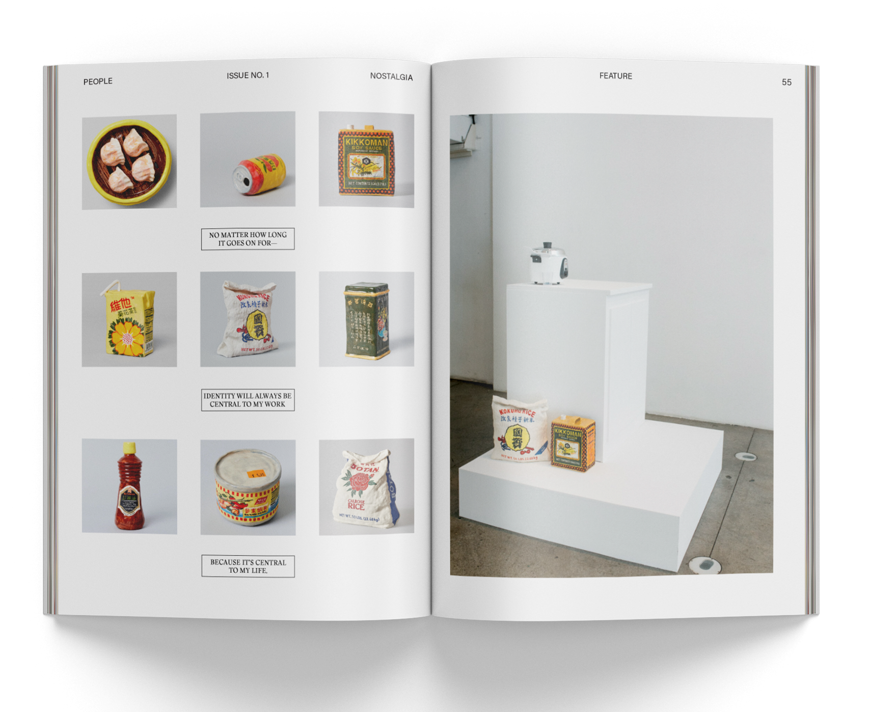
The second article features an insightful interview with a talented ceramic artist who skillfully creates sculptures of Asian-American pantry items from the 80s and 90s. The article's immersive visual system brings readers into the exhibition gallery, offering a lifelike experience of the artwork.
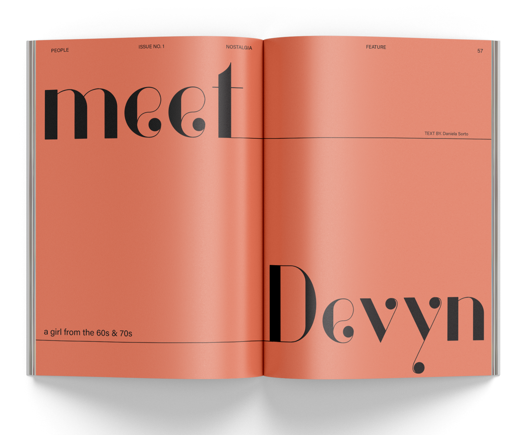
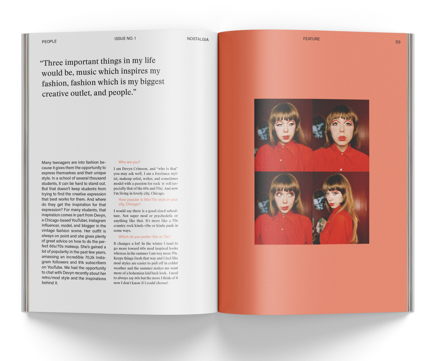
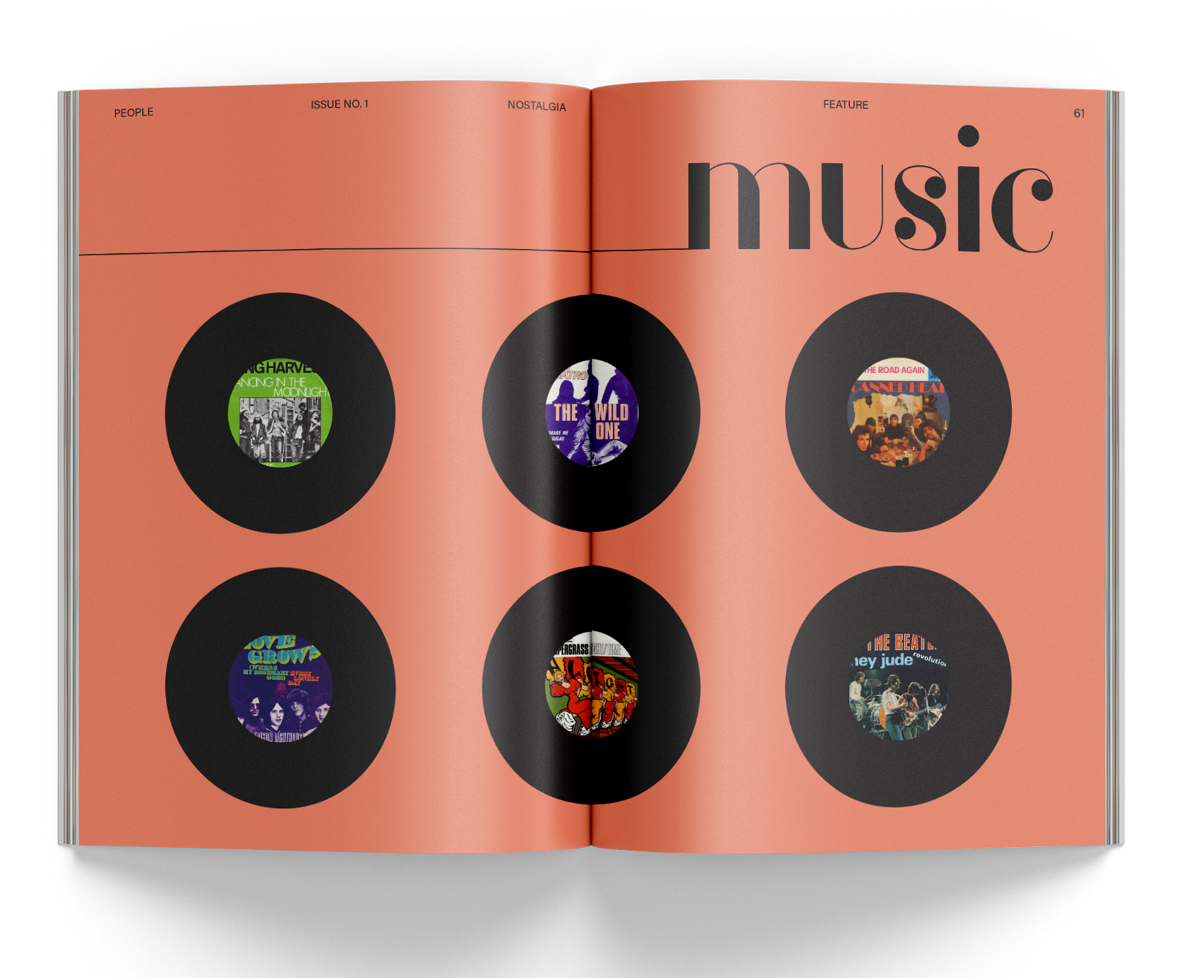
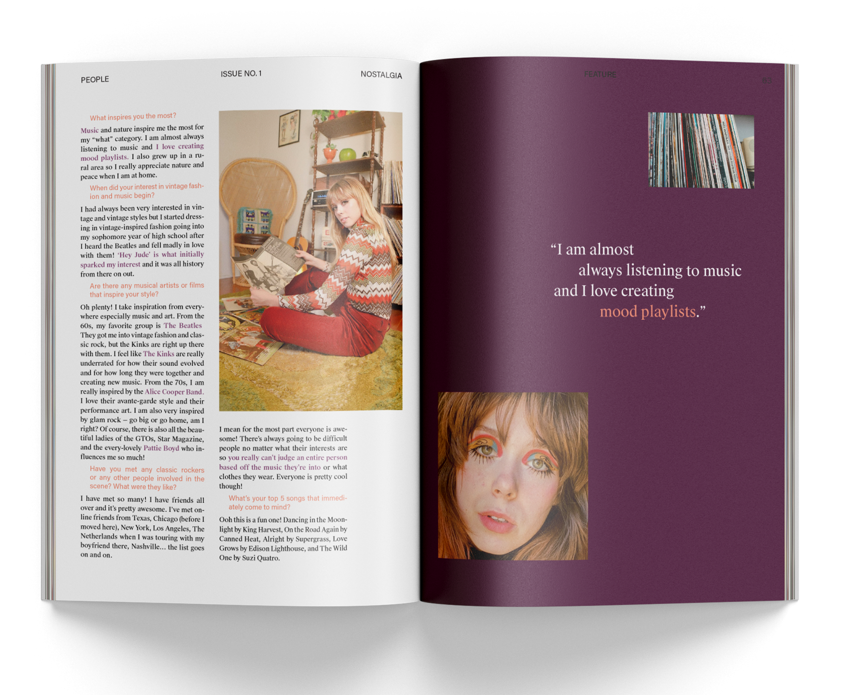
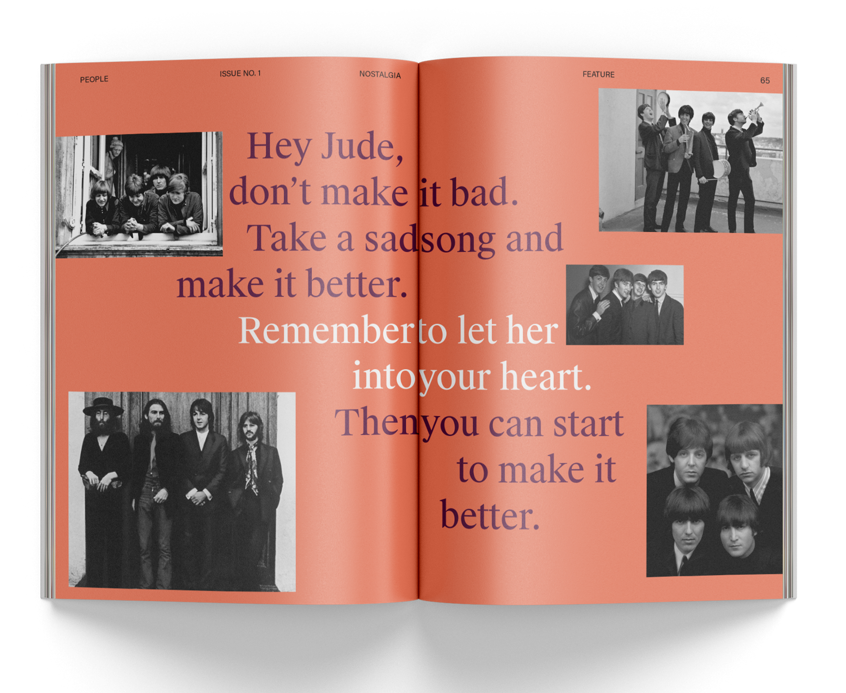
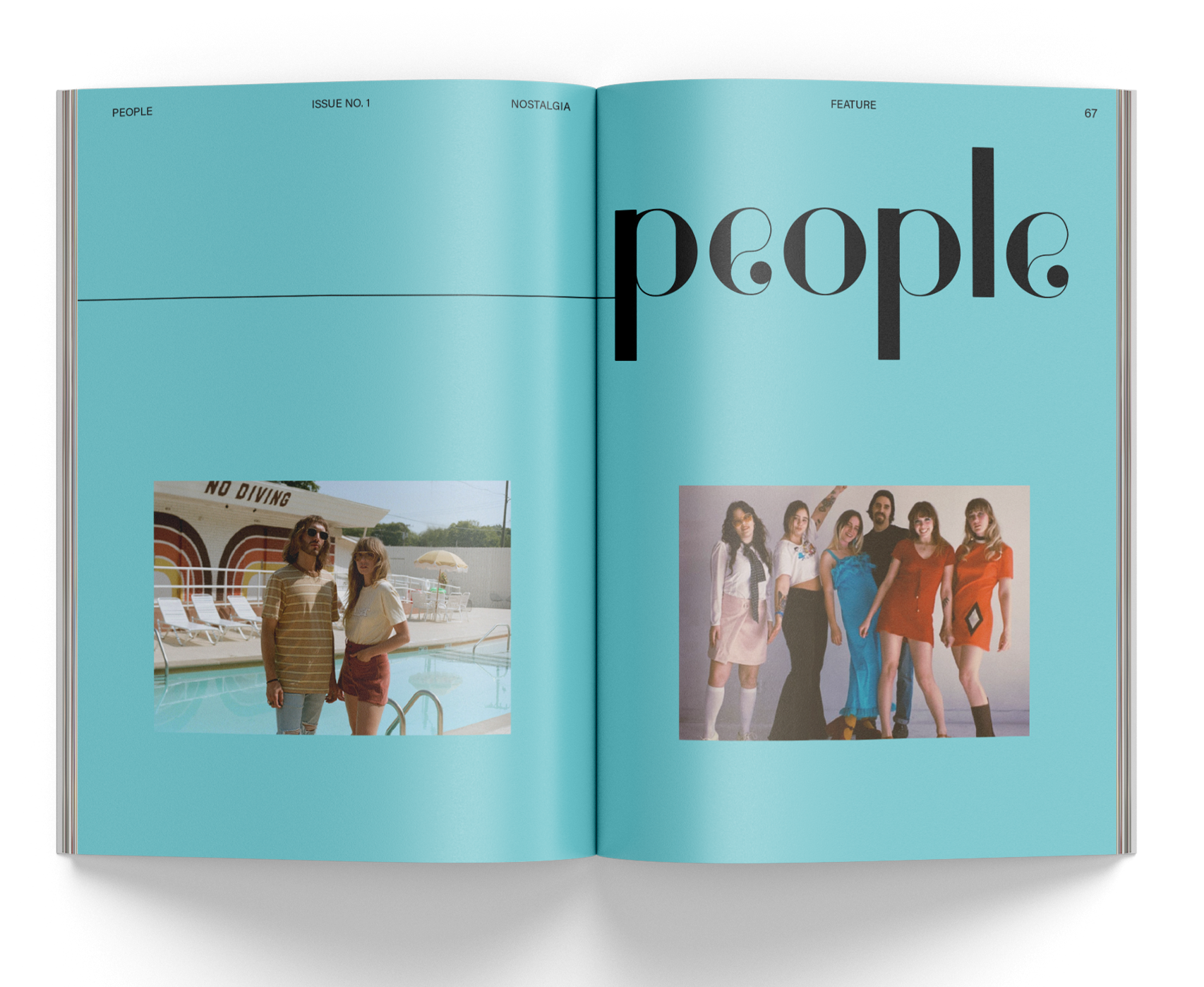
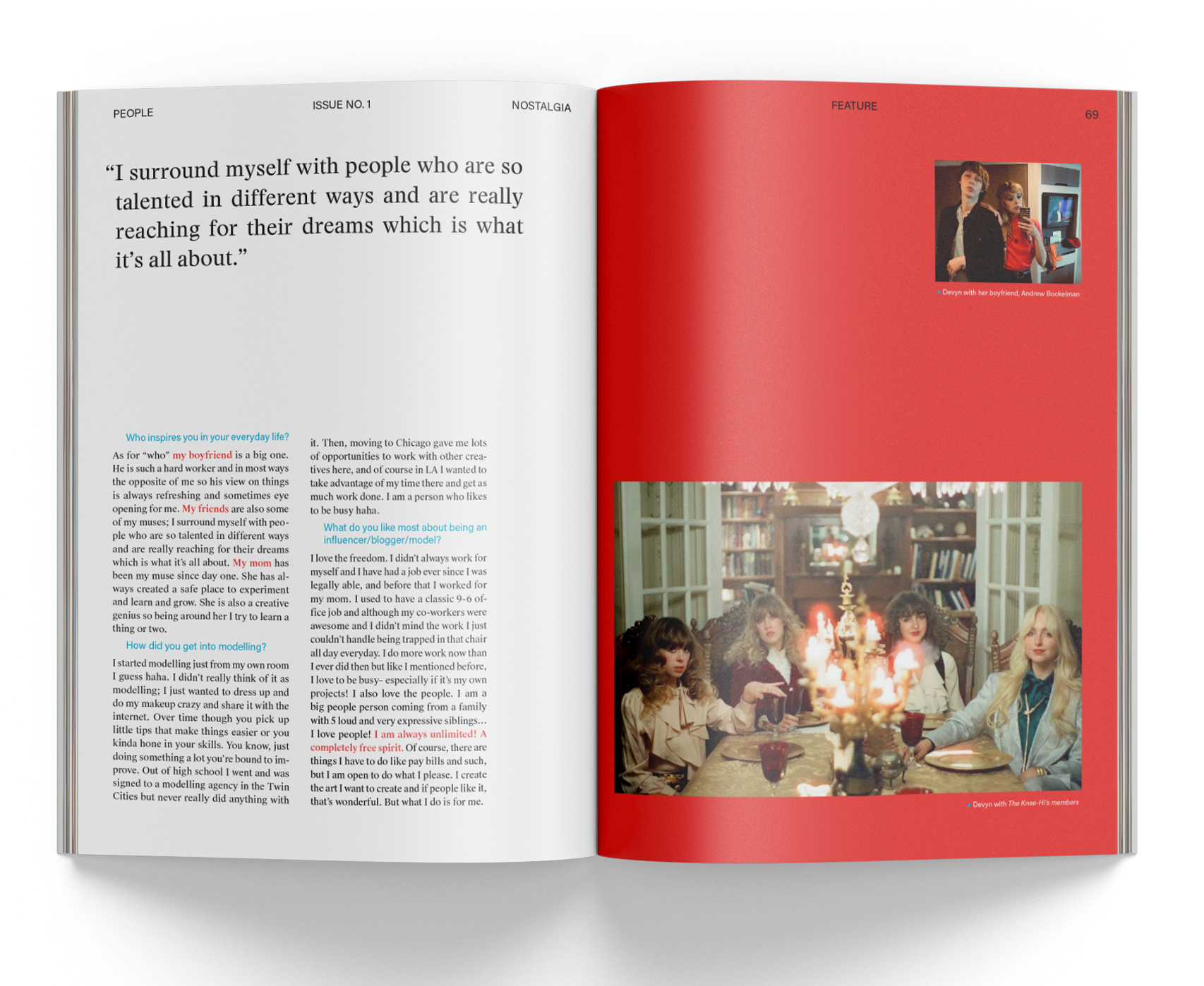
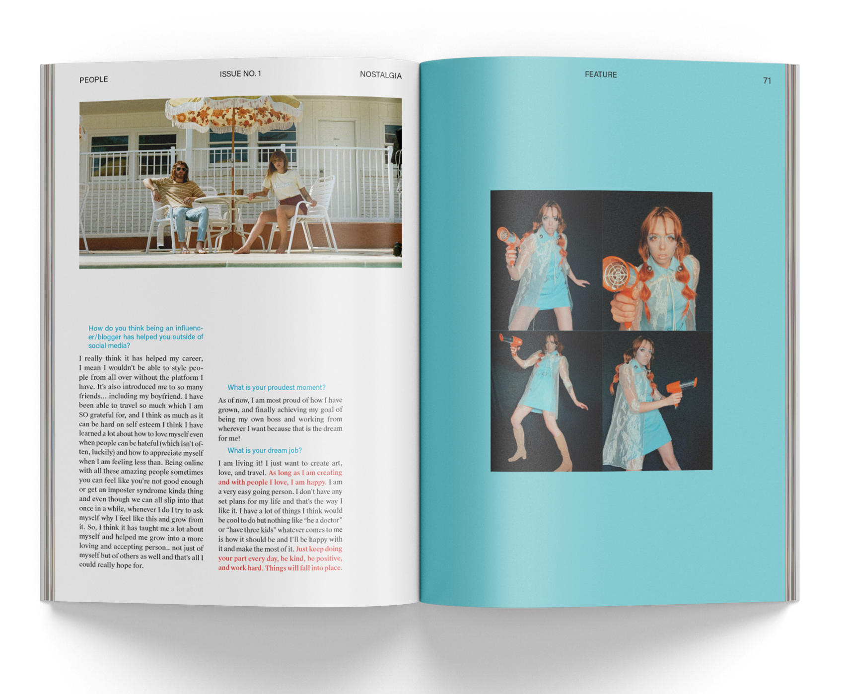
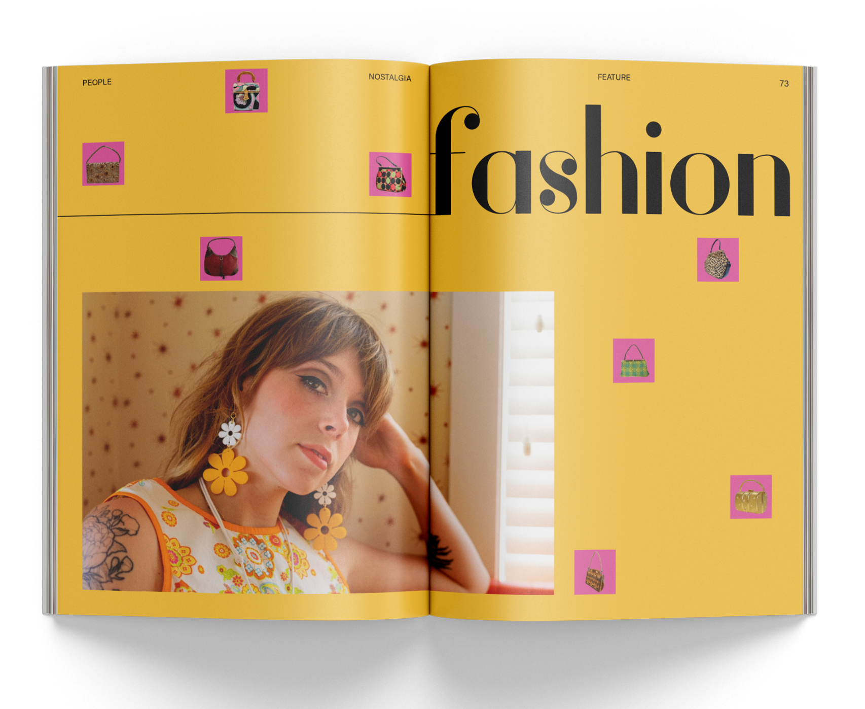
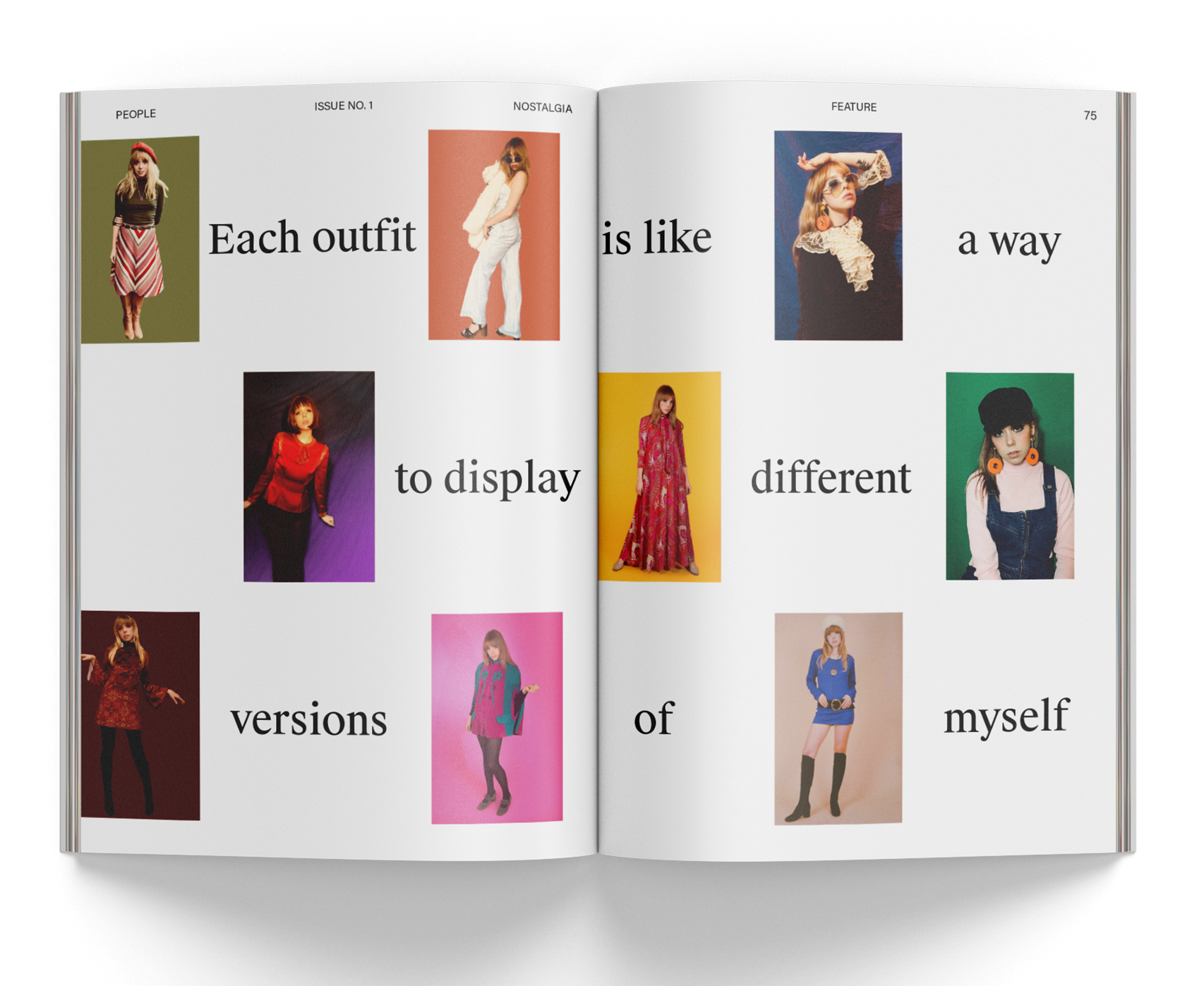
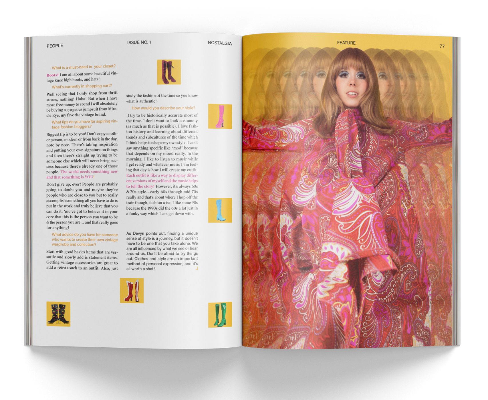
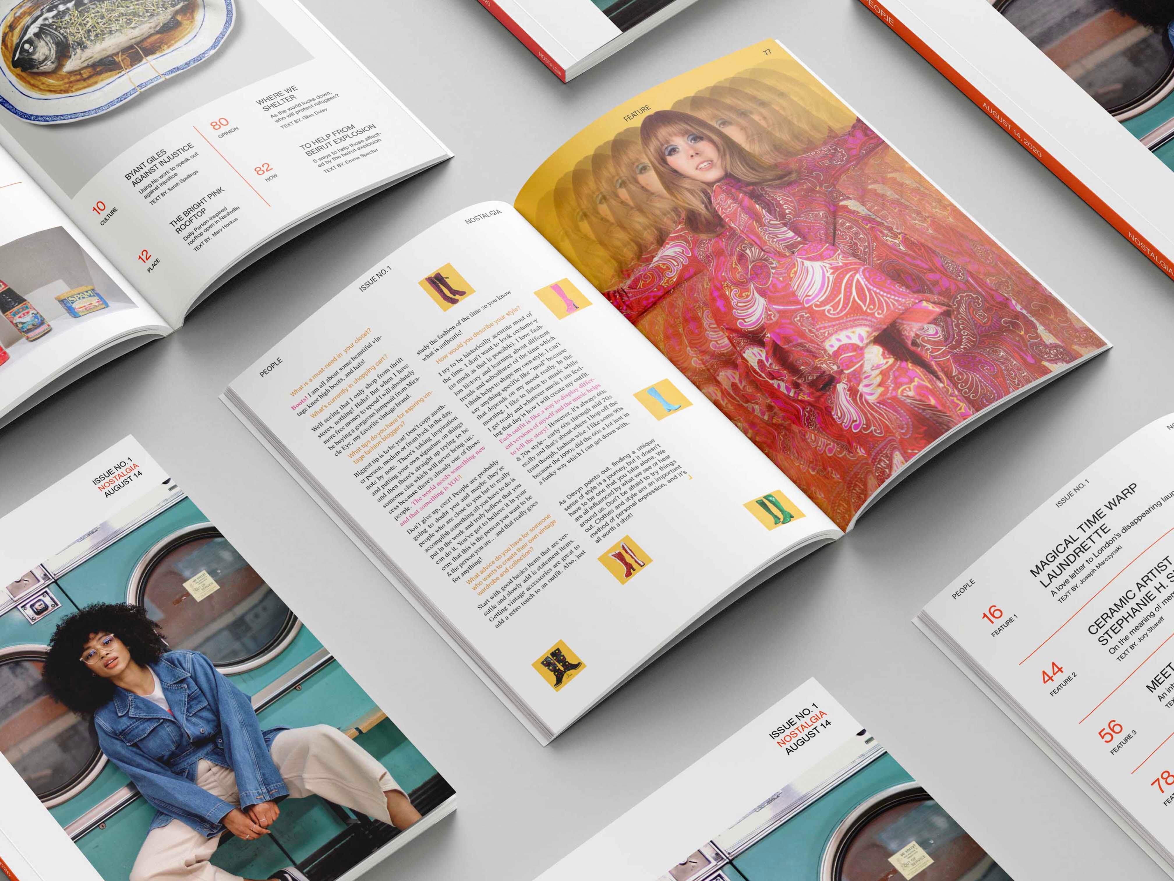
The third article presents an engaging interview with Devyn Crimson, a prominent content creator and influential figure in Chicago. The article cleverly uses four vibrant pop colors to symbolize different aspects of nostalgia: fashion, makeup, music, and lifestyle. These colors vividly bring to life each theme, providing readers with a captivating glimpse into Devyn's world of retro-inspired creativity and style.
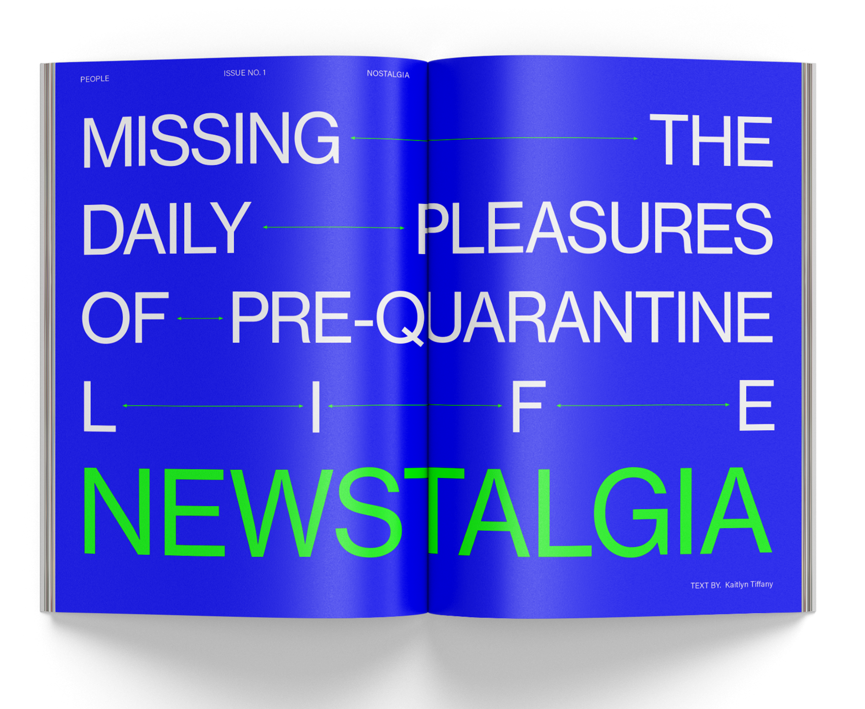
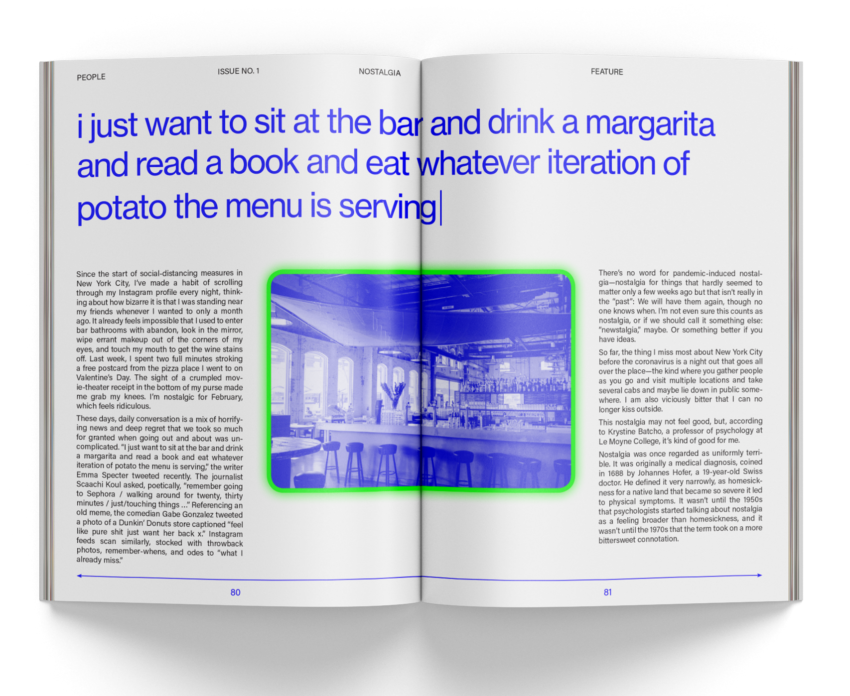
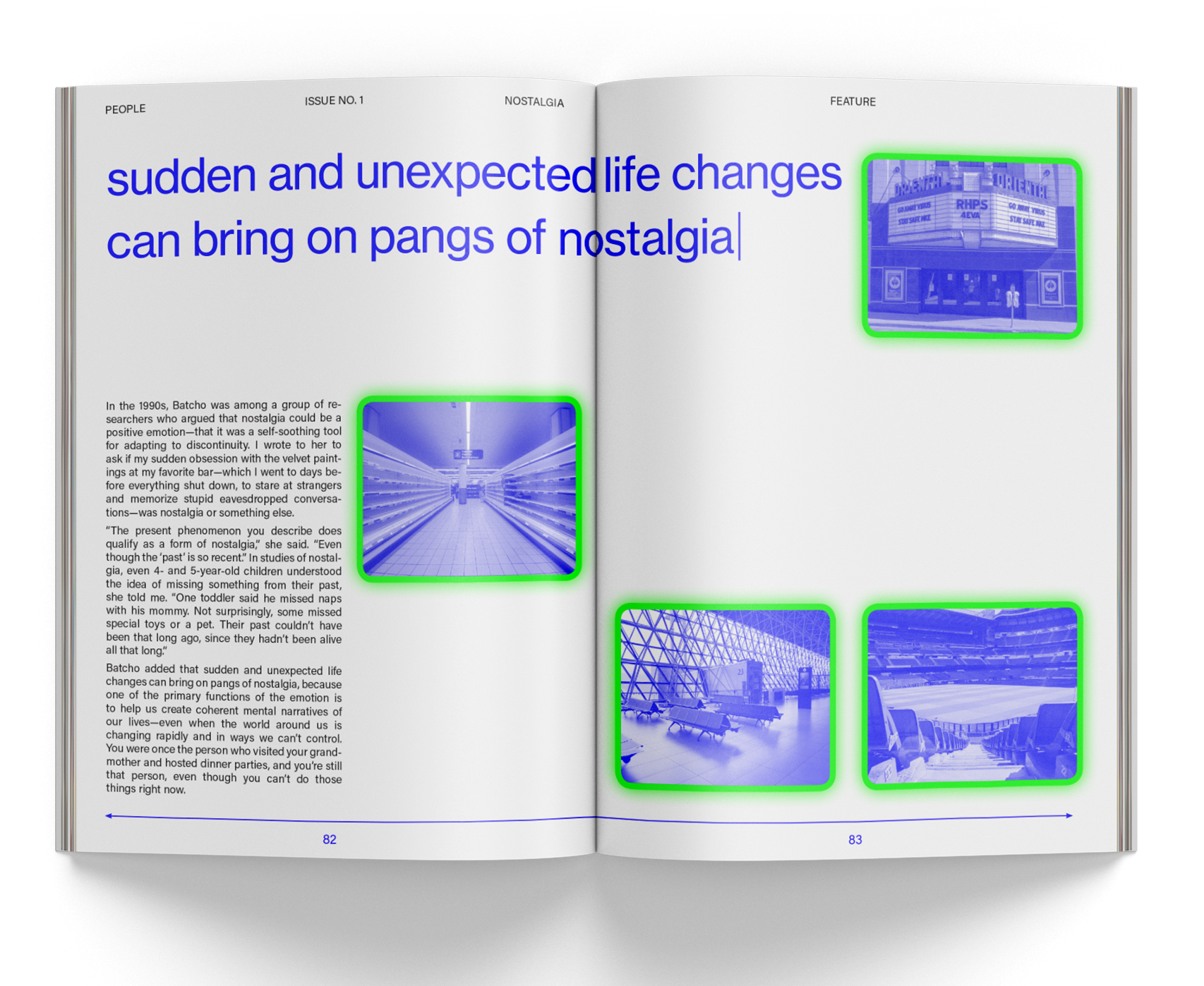
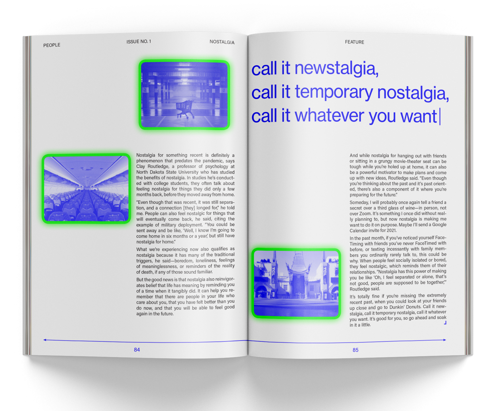
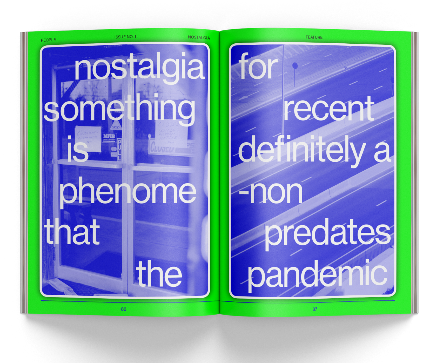
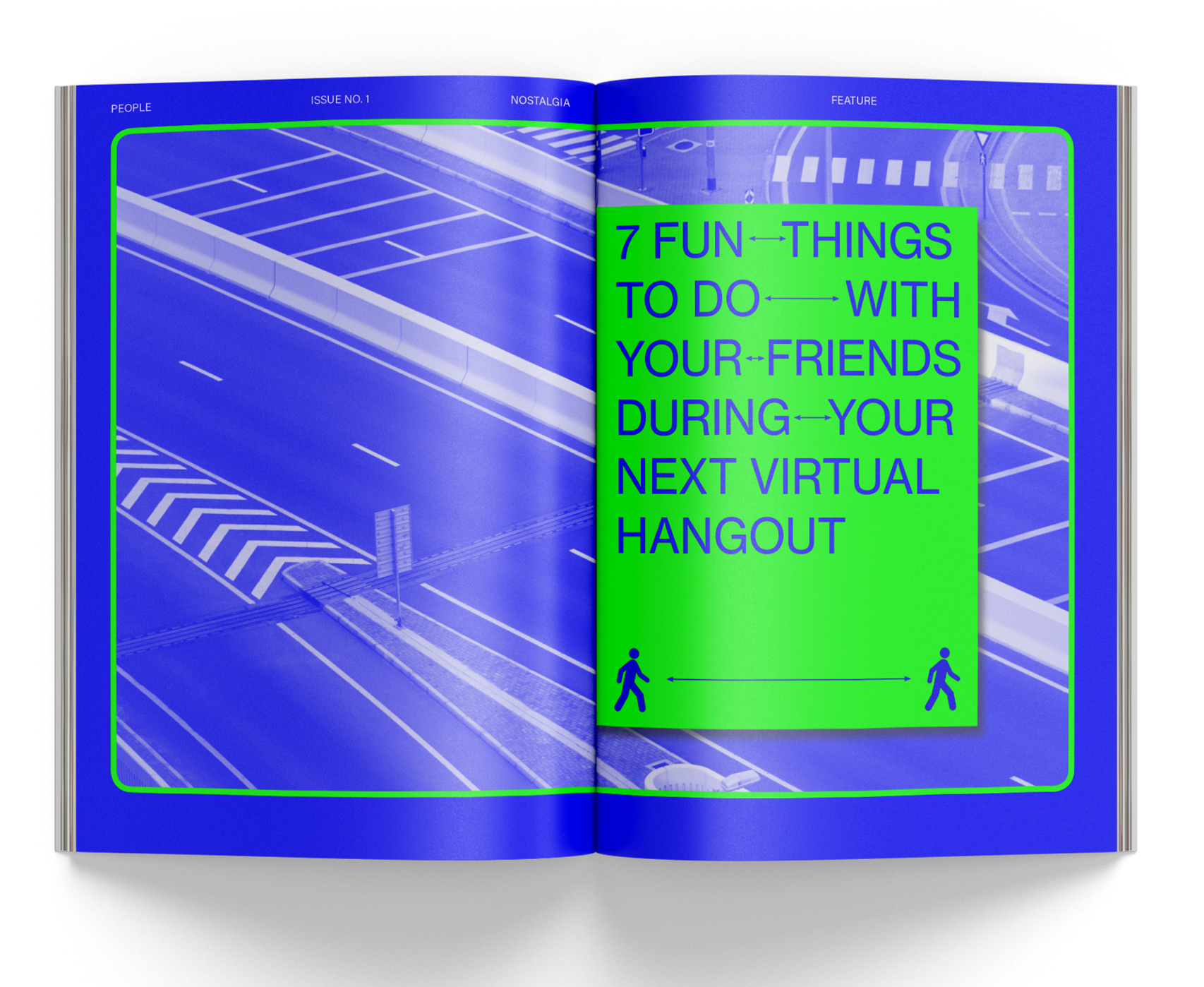
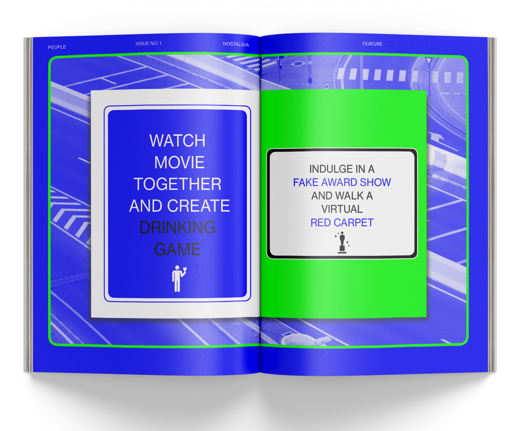
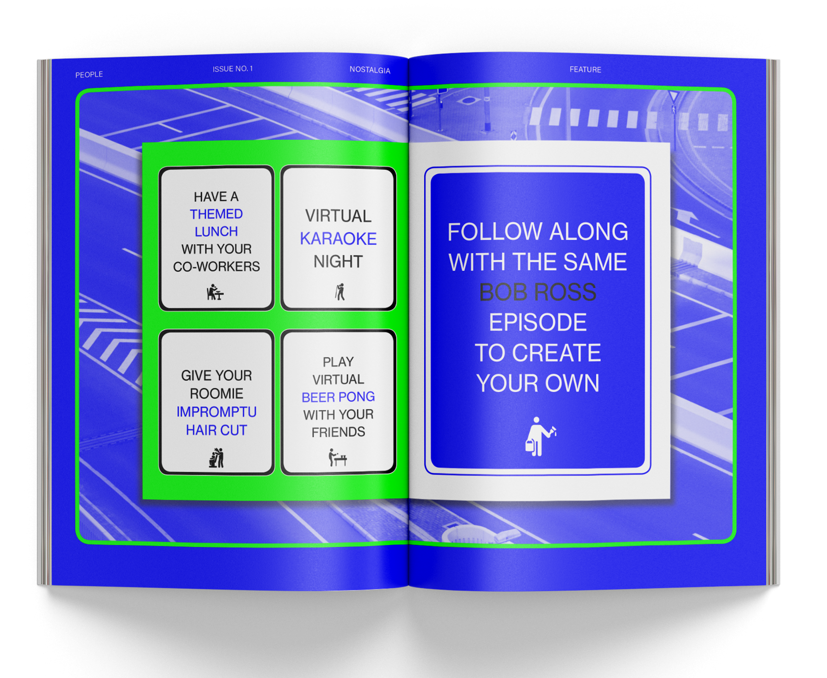

The final article explores the concept of modern nostalgia, arising from the yearning for the recent past amid the transformative changes caused by the COVID-19 pandemic. The use of exceptionally vibrant colors throughout the section captures the surreal and bizarre moods experienced during the initial stages of the pandemic, immersing readers in the emotions and experiences of this unique time in history.
(PPL X Laundrette)
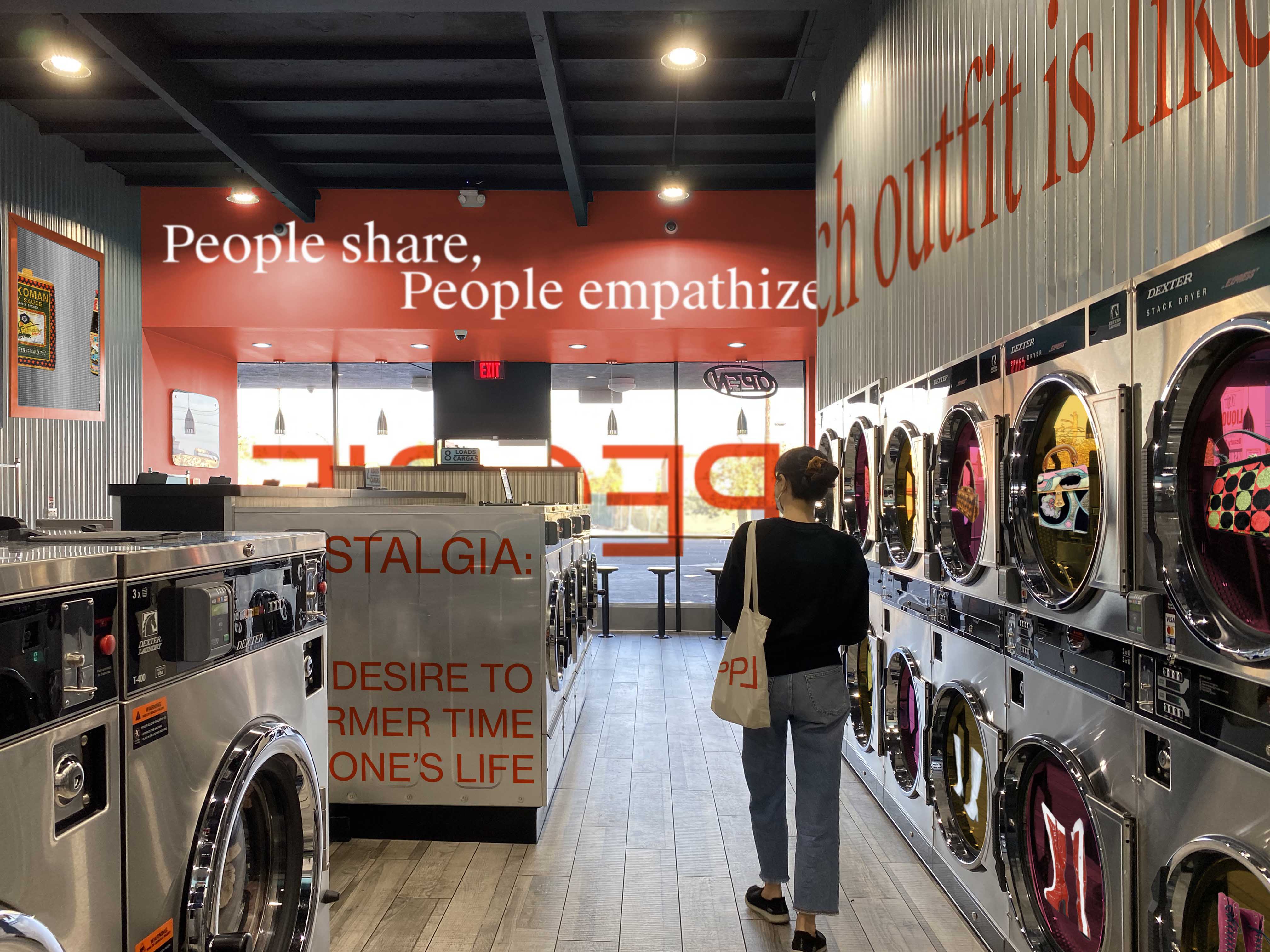
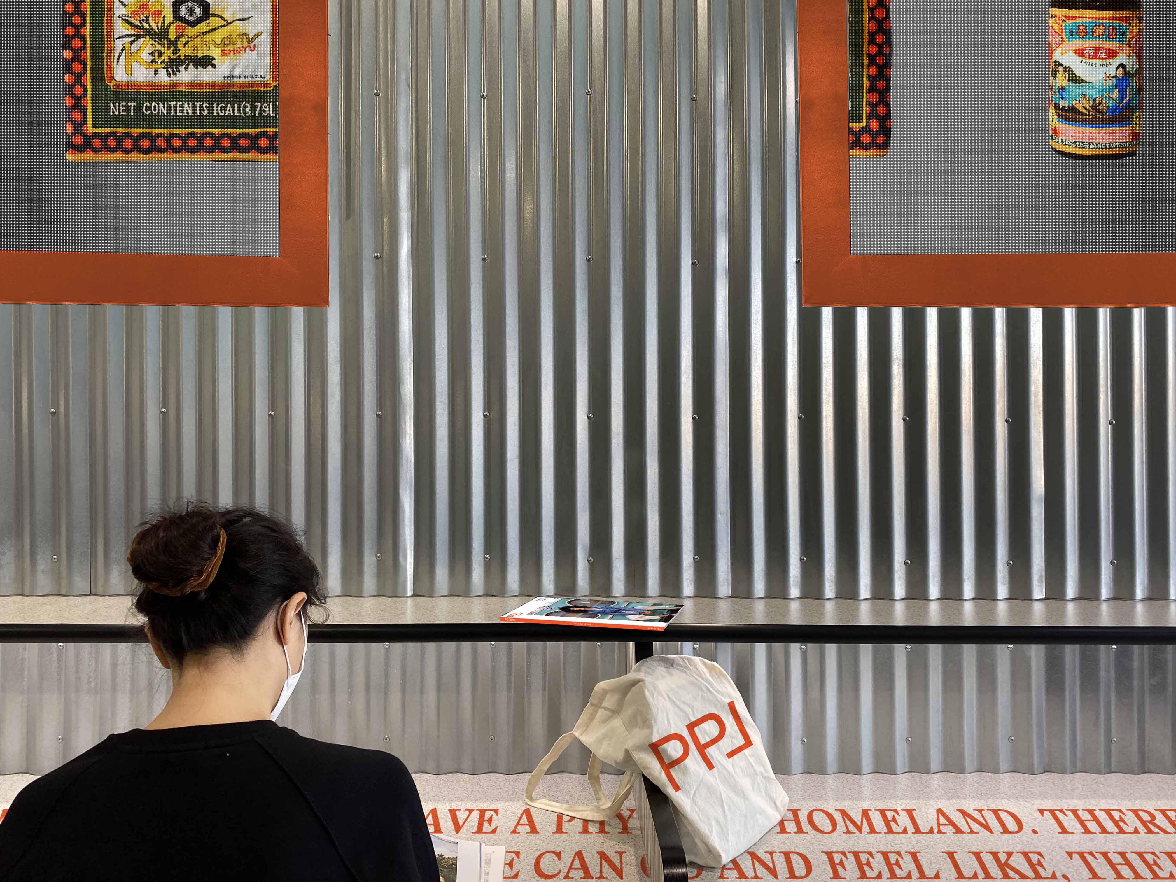
Laundrettes in different countries will serve as launch venues for the magazine's rebranding. Visitors can immerse themselves in a space that reflects the contents, themes, and aesthetics of the inaugural issue while waiting for their laundry. They can enjoy reading the magazines, interact with the thoughtfully designed interior, and take home special souvenirs as mementos.
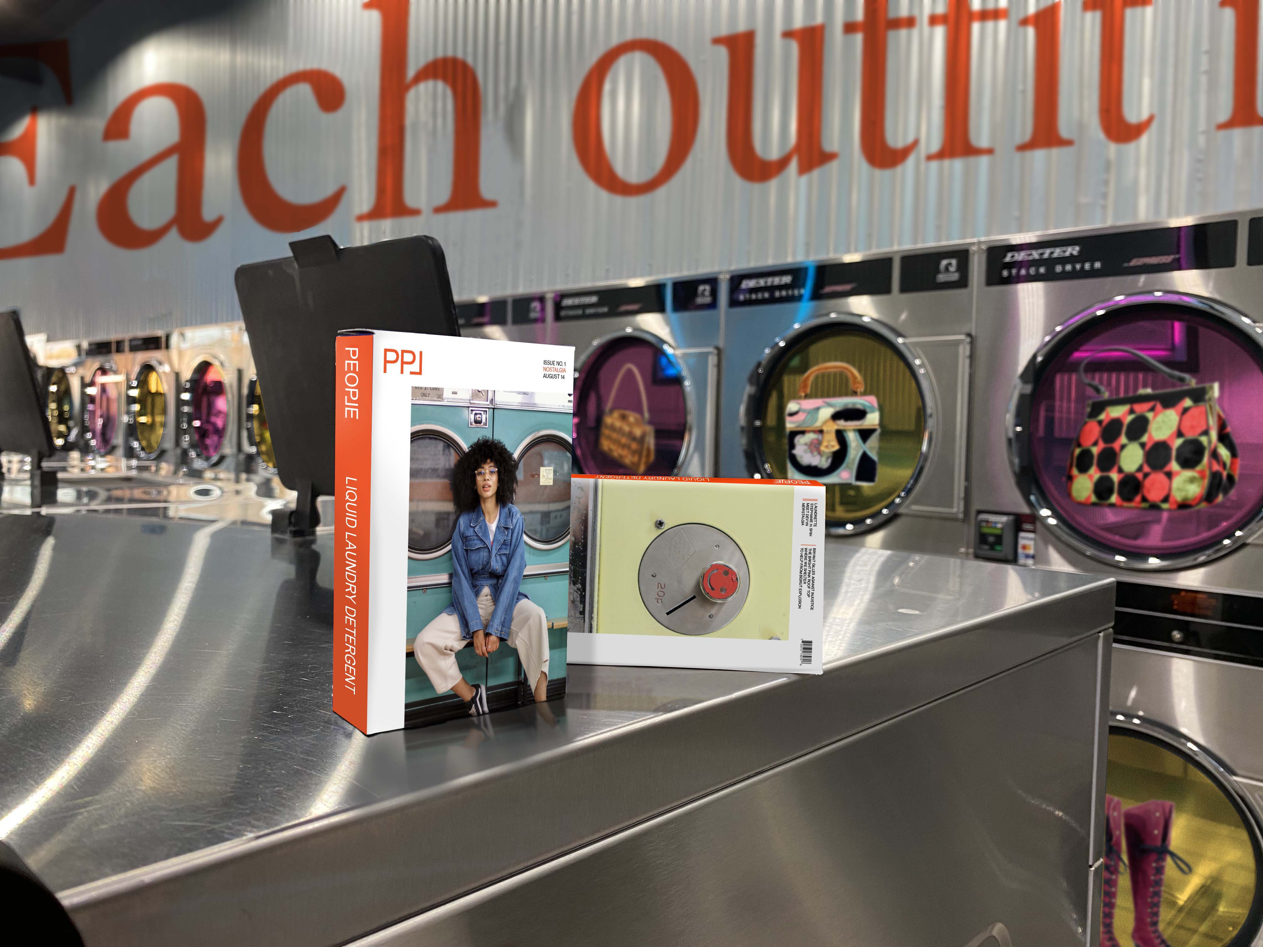
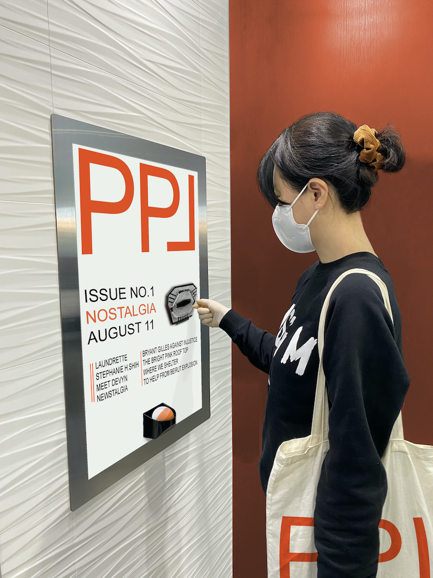
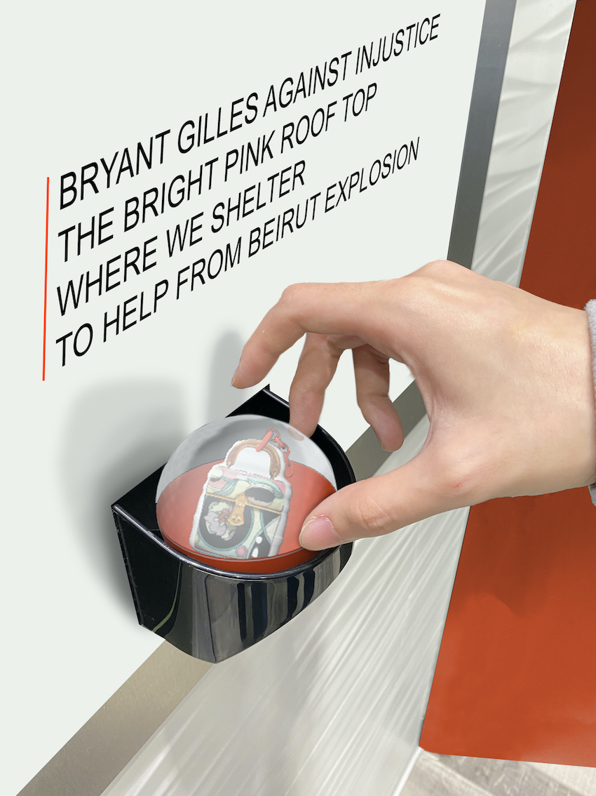
An exciting feature awaits visitors as they can purchase keychains from a random vending machine. These keychains are uniquely designed, featuring fashion items inspired by Devyn's iconic style. This adds an element of surprise and delight, providing visitors with a tangible keepsake to cherish.


